Variations on the Vancouver Canucks, Jan–May 2019 (updated Apr 2022)
I tried to combine or introduce different styles to some of the team's many logos throughout history.
Hover over/tap on an icon for info and jerseys.

Johnny x Flying V
Standard
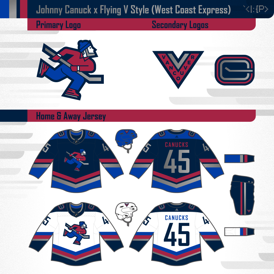
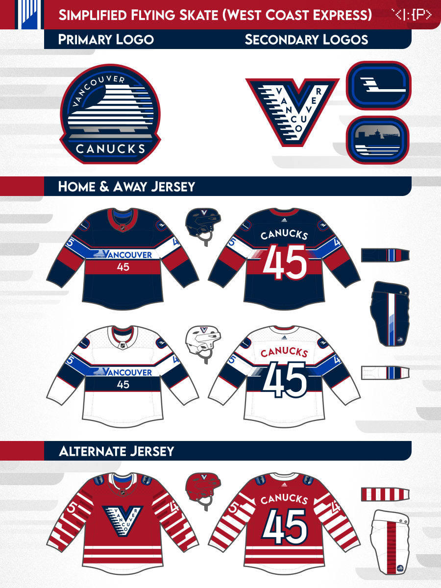
West Coast Express
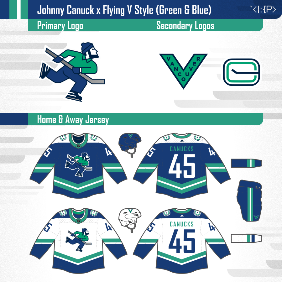
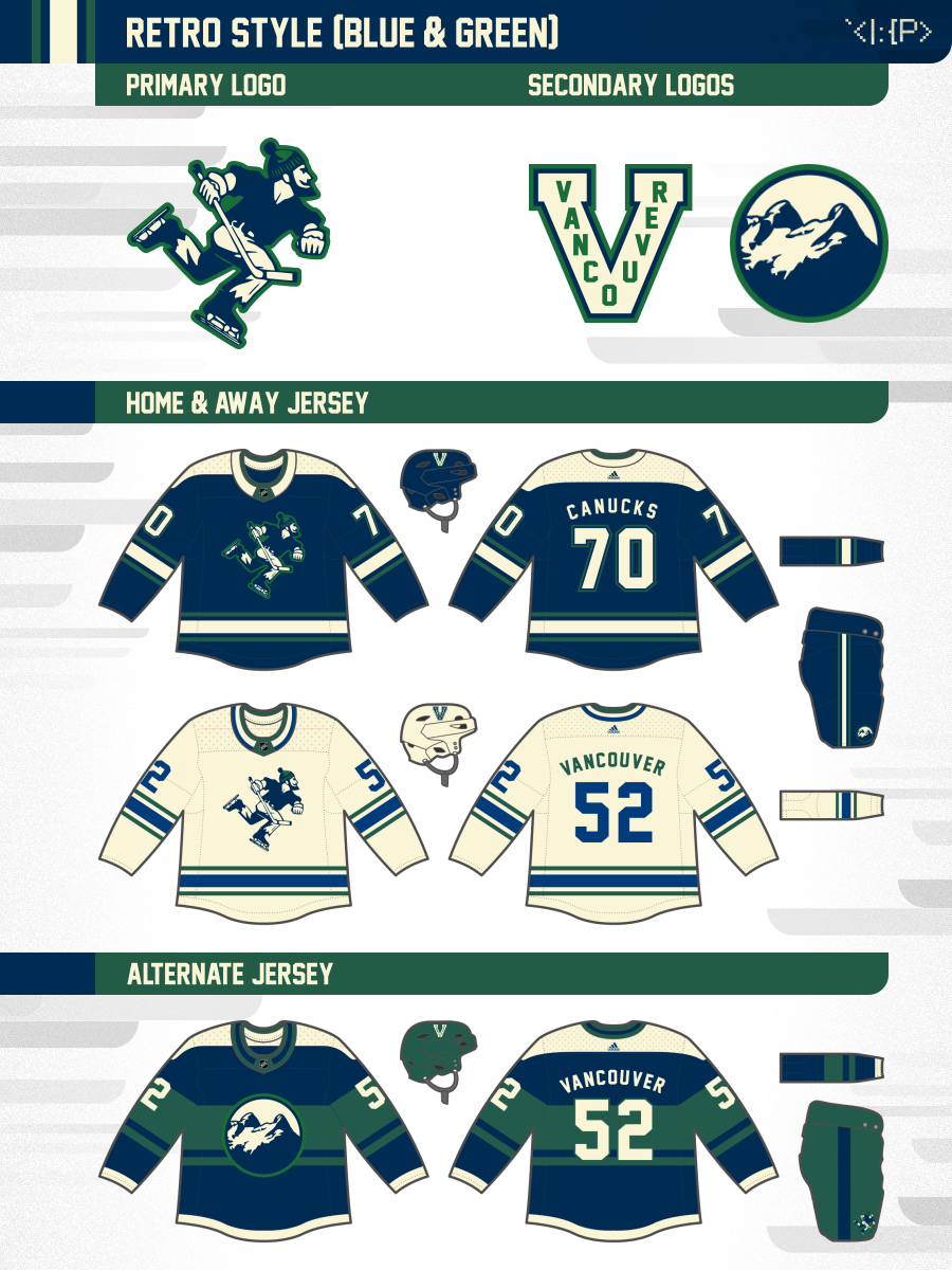
Green & Blue
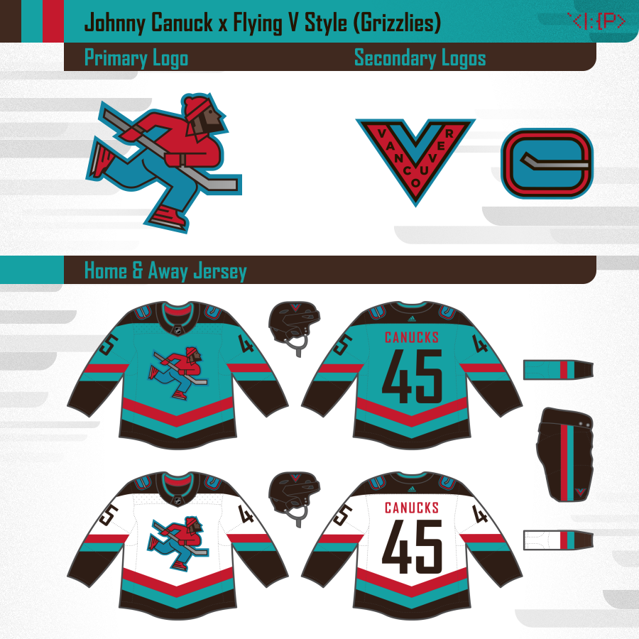
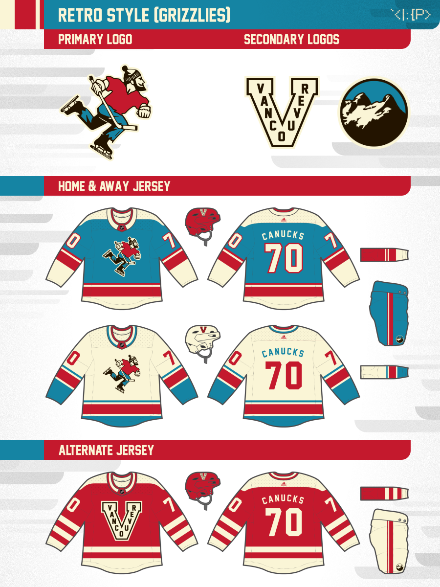
Grizzlies
2019 Original Version
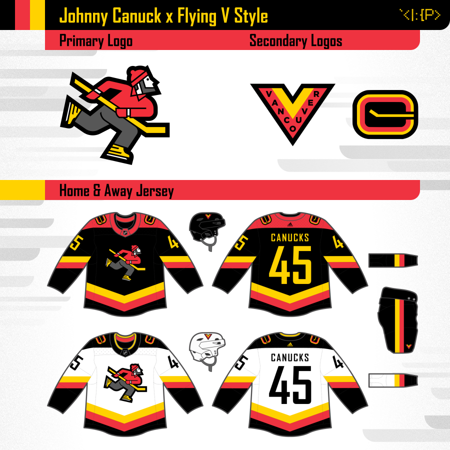
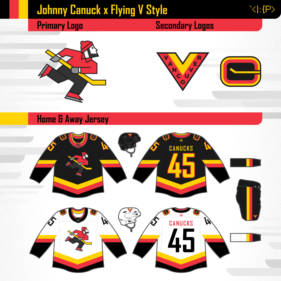
Johnny Canuck x Flying V Style (updated 2022)
- Primary logo: My version of Johnny Canuck in Flying V style
- Secondary logos: Adapted versions of Millionaires V & Stick in Rink in Flying V colors
See different versions of this design by hovering over / tapping the options above!
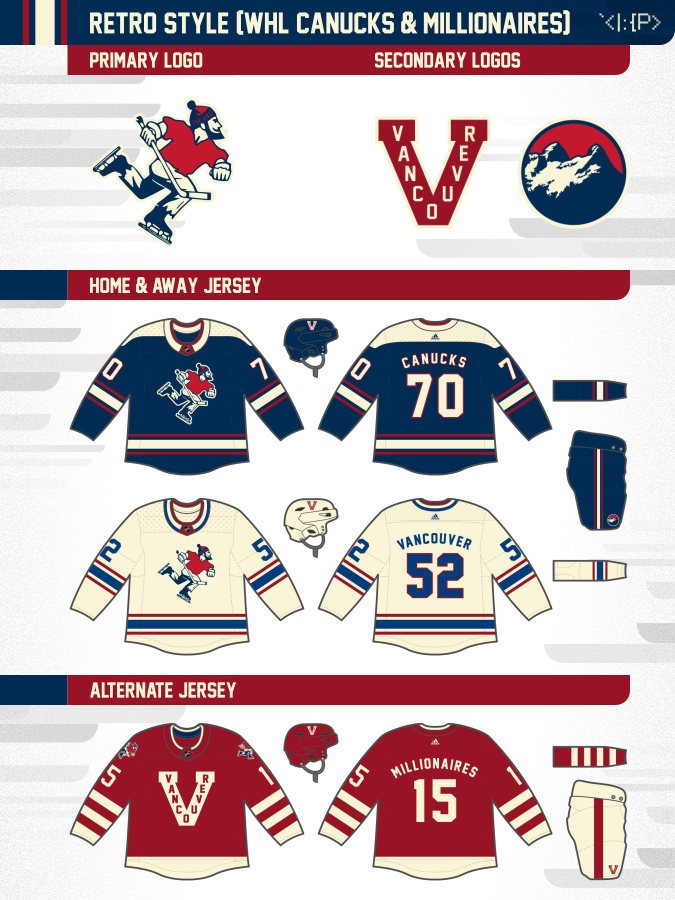
Retro WHL-Inspired
Grizzlies-Inspired
Standard
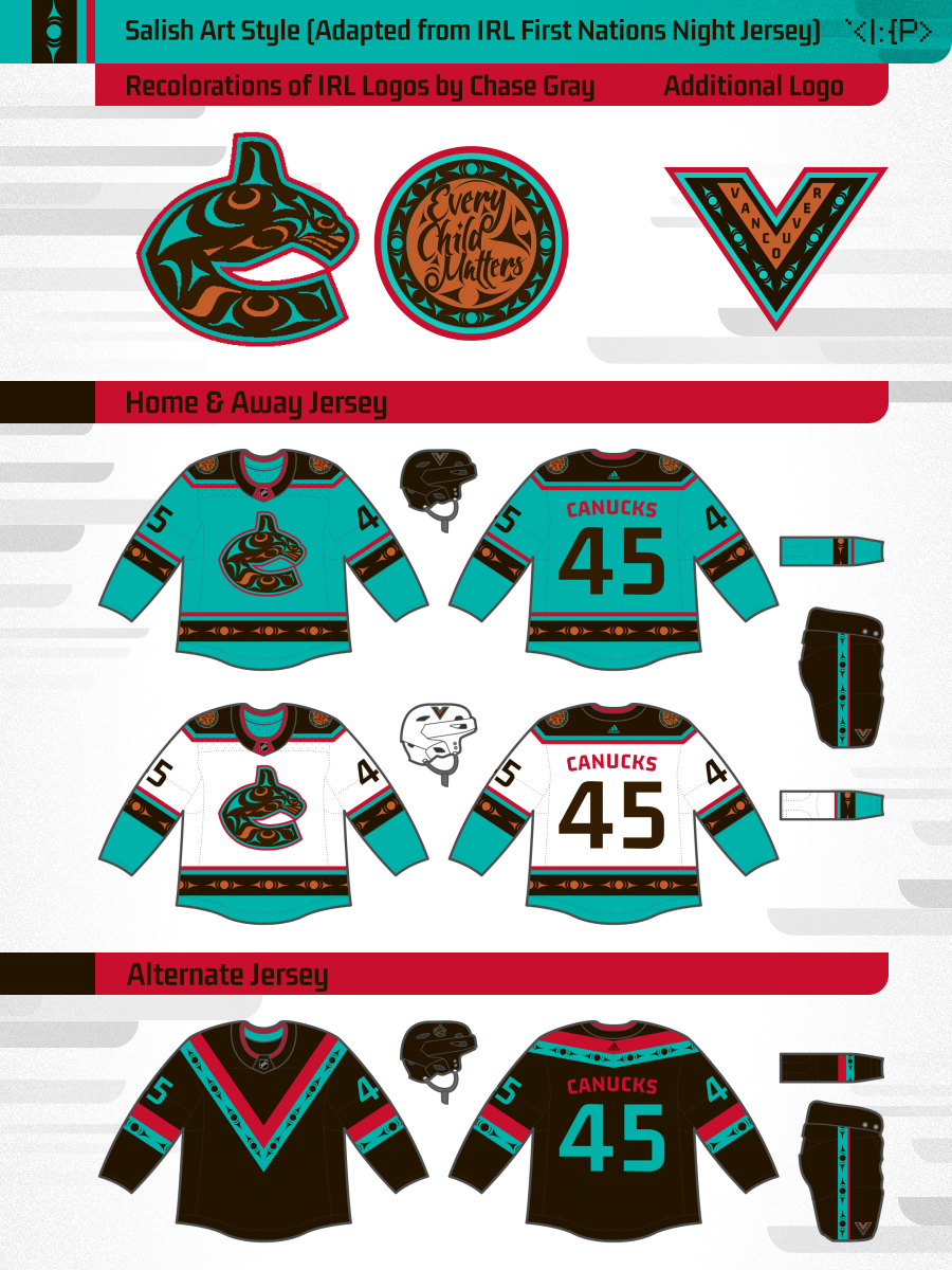
Salish Art Style
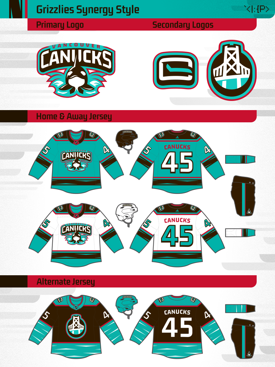
Grizzlies Synergy Style
- Primary logo: Inpspired by the '90s Vancouver Grizzlies logo. Front-facing aggressive bear becomes an orca, and 3D arched wordmark.
- Secondary logos: Adapted Stick in Rink, Lions Gate Bridge logo
The bonus version uses Coast Salish art like the Grizzlies originally did, adapted from the 2022 Canucks First Nations Night jersey by Chase Gray.
Simplified Skate
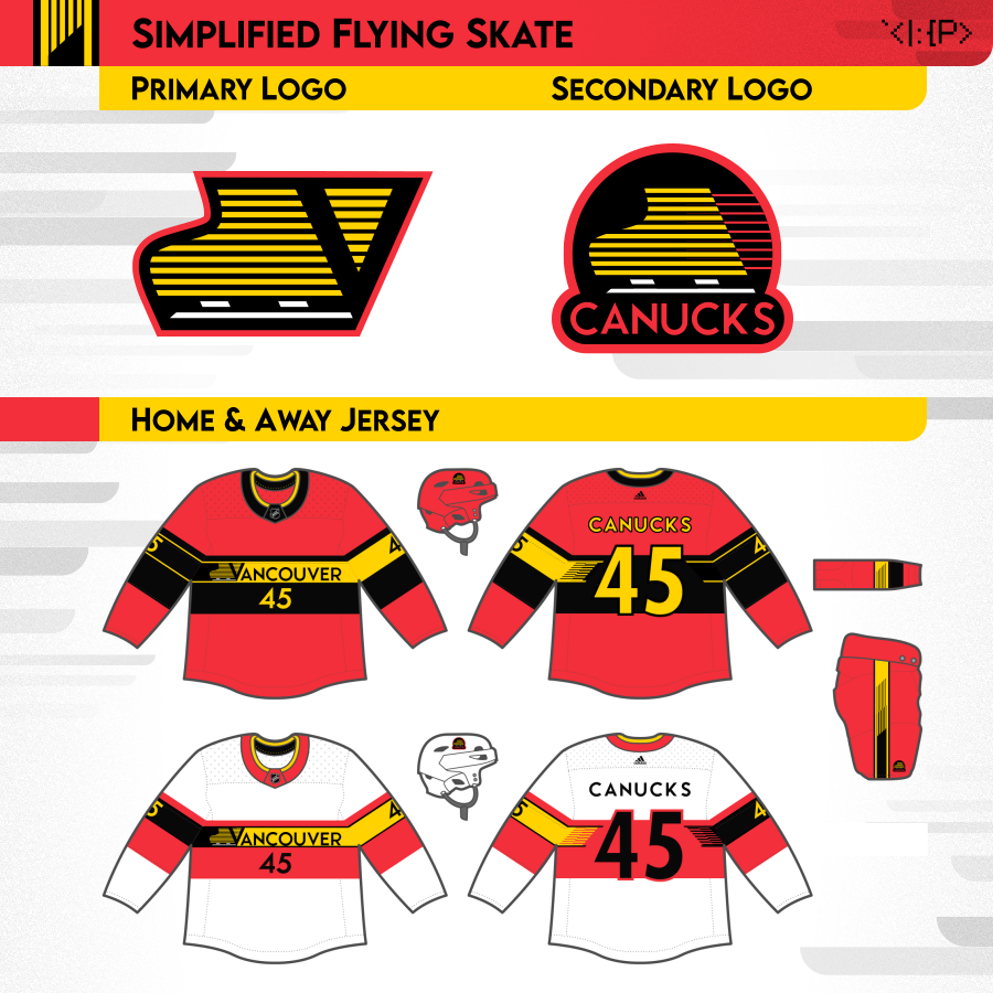
Standard
West Coast Express
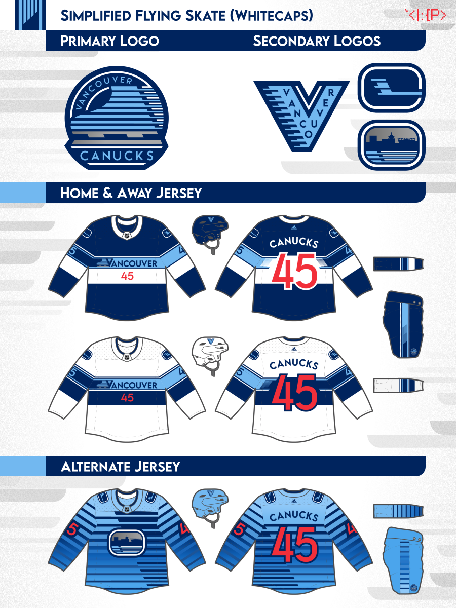
Whitecaps
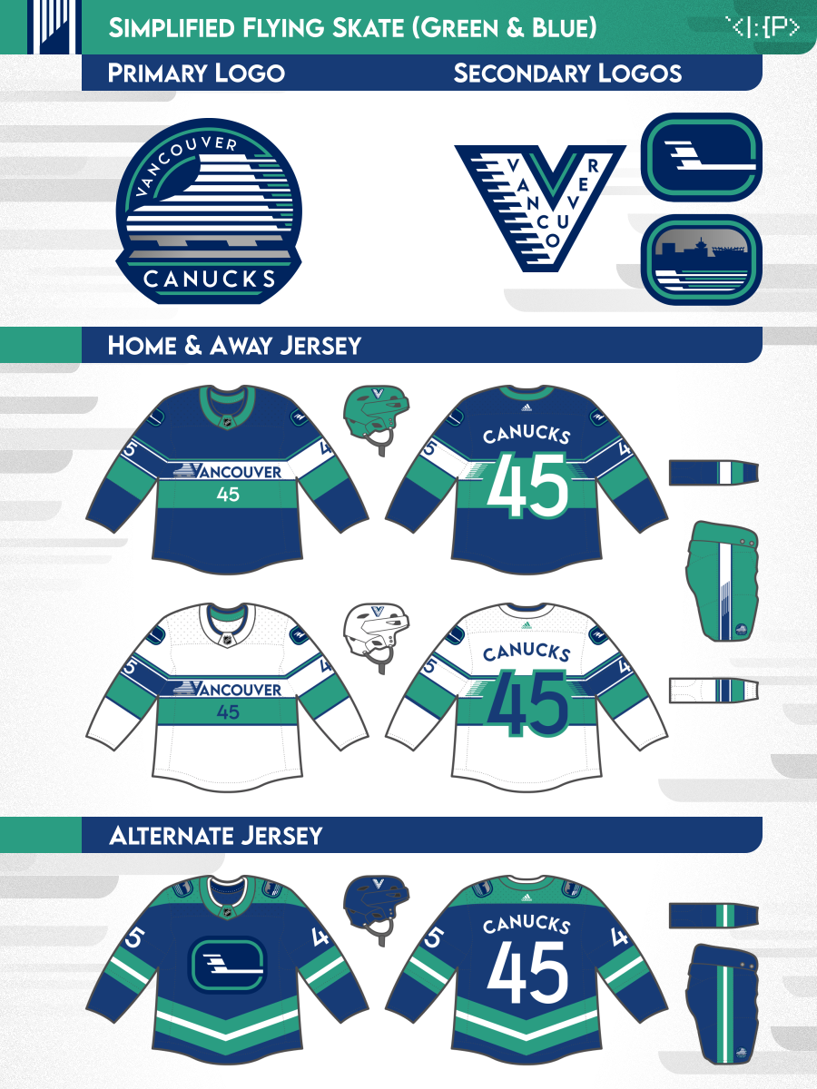
Green & Blue
Original 2019 Version
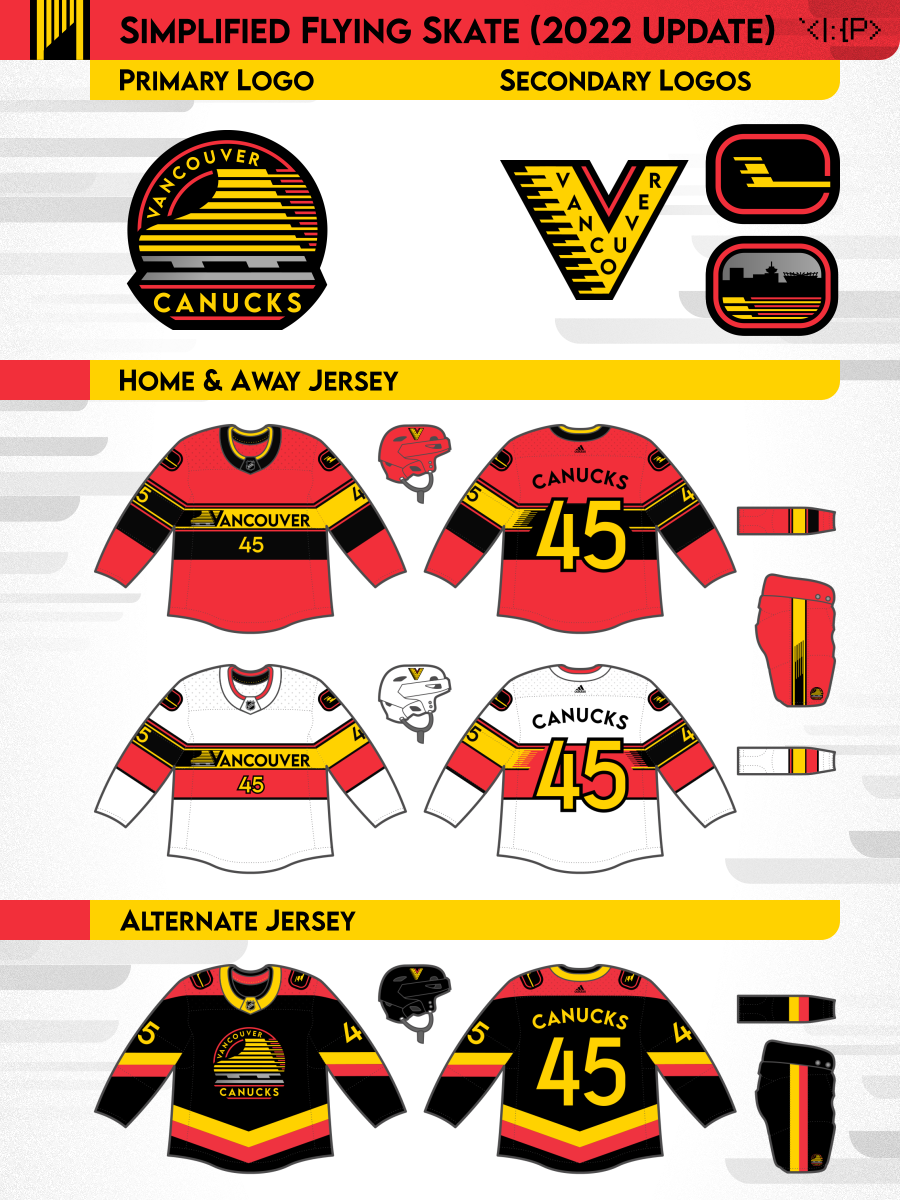
Simplified Flying Skate (updated 2022)
- Primary logo: Simplified / modernized version of '90s flying skate logo
- Secondary logo: Adapted Millionaires V and Stick in Rink, Skyline logo
- Uniforms: My attempt to salvage the '90s Red Skate alt
See different versions of this design by hovering over / tapping the options above!
Flag-Inspired
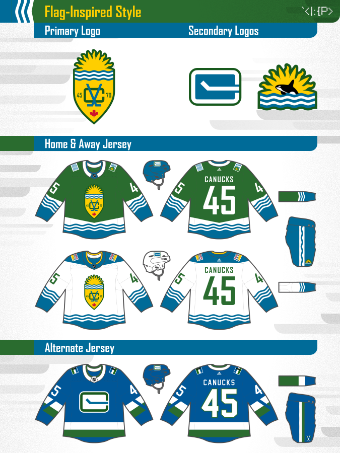
Flag-Inspired Style
- Primary logo: Sun & waves from BC flag, shield from Vancouver flag, inspired by unused monogram
- Secondary logos: Orca w/ BC sun & waves, Stick in Rink
- Home & away uniforms: Based on flags of Vancouver and BC, respectively
- Alternate uniform: Based on Cascadian flag + 1970 Canucks jersey
Lumberjack Plaid
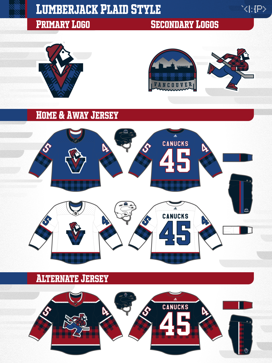
Lumberjack Plaid Style
- Primary logo: inspired by current Johnny in V logo
- Secondary logos: Skyline & mountains above two-man saw, plaid version of my full body Johnny logo
- Alternate uniform: Inspired by 2000s alt gradient jersey
Skyscraper / '89 Unused
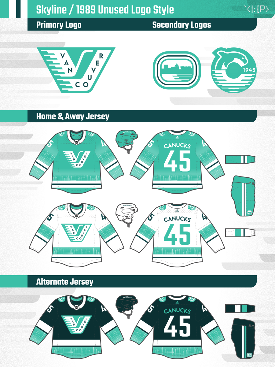
Skyscraper x 1989 Unused Rebrand Style
- Primary logo: Based on the logo from the Canucks' unused rebrand created in 1989
- Secondary logos: Matching skyline logo and orca logo
- Uniforms: Striping with pattern inspired by the seafoam green glass buildings of the Vancouver skyline
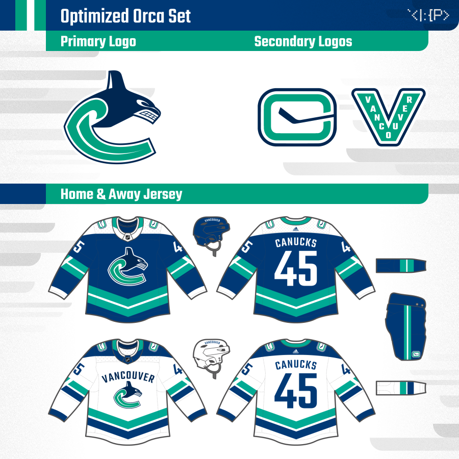
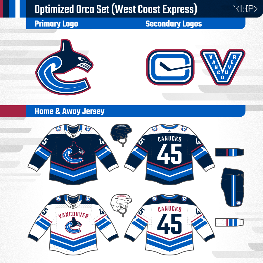
Optimized Orca
Standard
West Coast Express
Optimized Orca Set
- Primary logo: Simplified version of current logo that removes the awkward shards and the un-necessary silver, as well as introducing green into the logo
- Secondary logos: Current IRL Stick in Rink logo, updated Millionaires V
- Uniforms: Merging the 1970 inaugural NHL Canucks jersey's striping with a bit of a Flying V flair, and adding the yoke and arched text of the WHL Canucks.
- Font is Teko, to have a slight change away from the awkward Agency FB while maintaining the general feeling.
Logo History
Vancouver Hockey Logo History
A quick recap of the history of hockey branding in Vancouver for those not in the know.