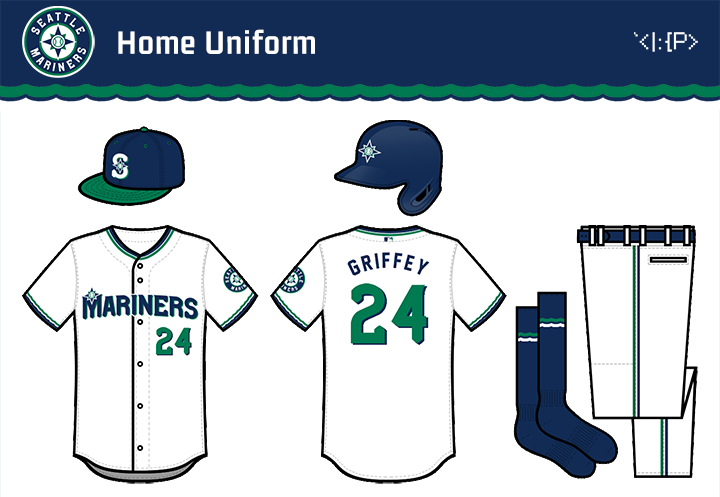
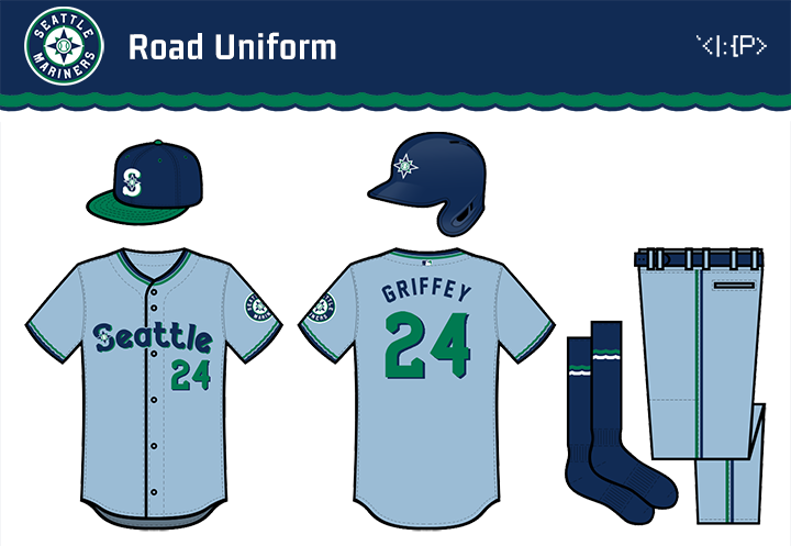
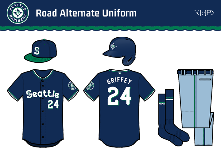
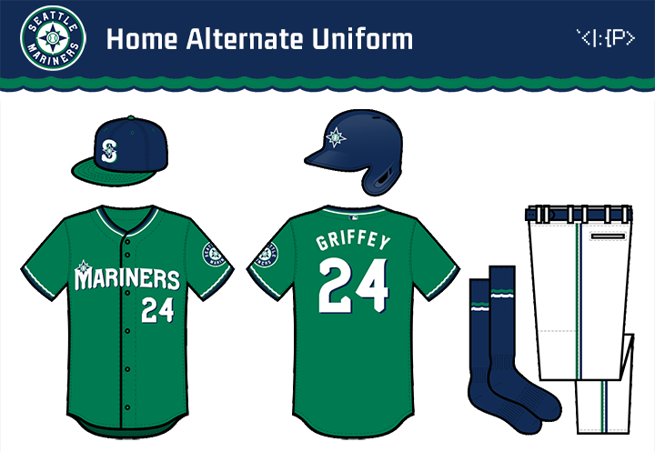
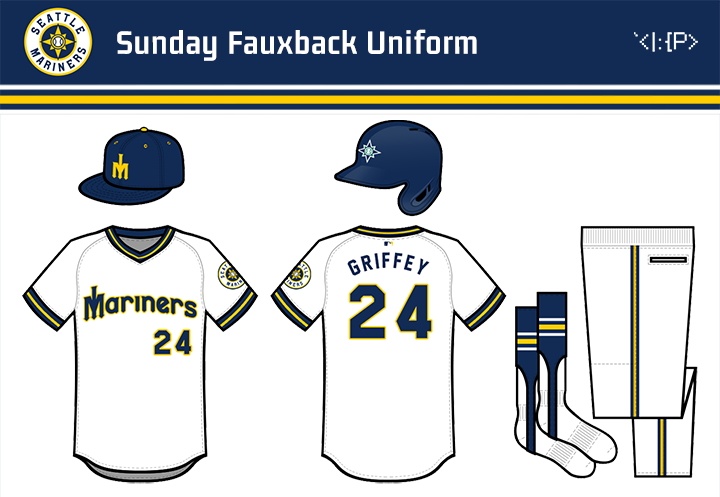
Seattle Mariners Logo Concept, April 2019
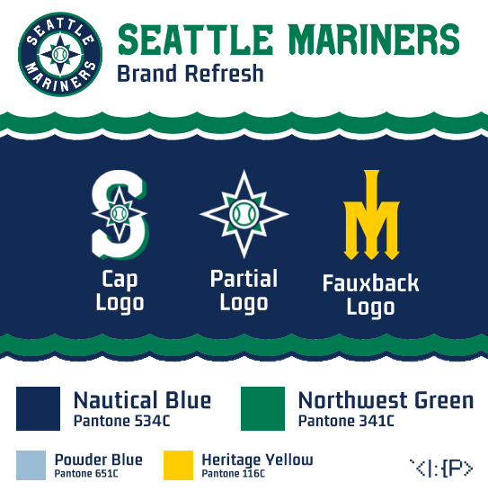
I think the Mariners have an outstanding identity (compass rose, beautiful colors) but currently have lots of execution issues (endless outlines, disjointed elements, and strange line weights).
I tried to combine the current and retro wordmarks, and keep it all a bit simpler.