PWHL Concepts, Feb–Mar 2024

Based on the rumored names for the upcoming brands of the Professional Women's Hockey League.
Hover over/tap on an icon for info and jersey.
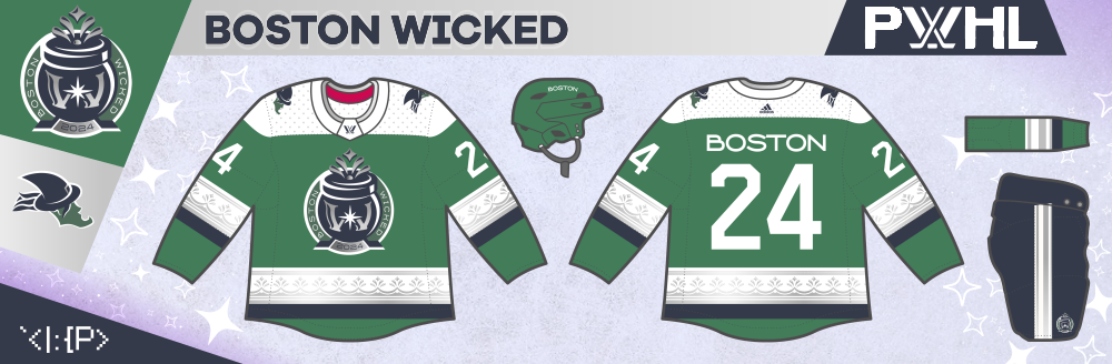
Boston Wicked
Though I think Mark Crosby's "New England Curse" design would make a better starting point, I attempted a cauldron-themed roundel instead. The bubbling design is based on the patterns of brownstones. The alternate logo is a witch head in the shape of Massachusetts.
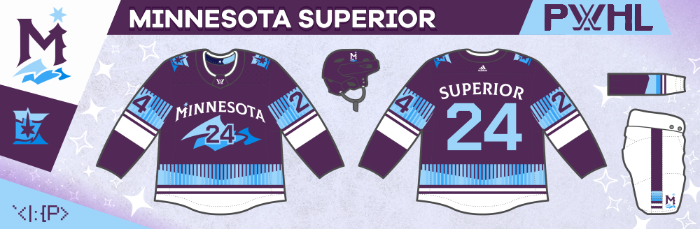
Minnesota Superior
The logo is influenced by the North Stars, with an aurora in the shape of Lake Superior, a tree, and the North Star. The jersey striping is also aurora-inspired and has an chevron element based on the new state flag.
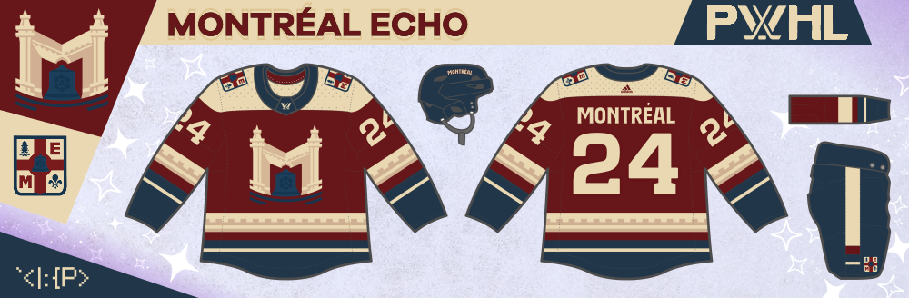
Montréal Echo
The best way I could think to capture the name "Echo" in a Montréal way was with cathedral bells. The M has a design based on the Notre-Dame Basilica of Montréal, and the bell has a narcissus flower (as a reference to the Greek myth.) The alternate logo is based on the city coat of arms, inspired by this Expos concept by sfgiants58.
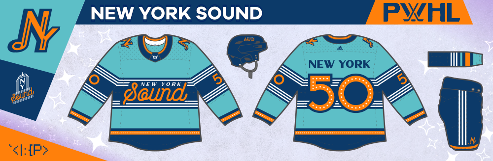
New York Sound
New York gets a Radio City Music Hall inspired design, with a script logo and a NY / music note monogram.
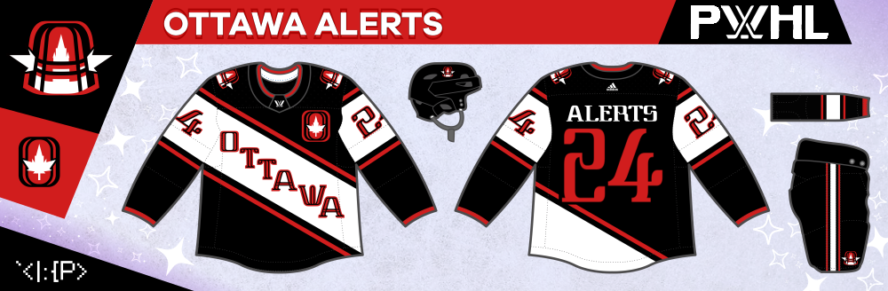
Ottawa Alerts
This Alerts jersey is a modern update based on the original 1910s design. The primary logo is a goal light with the Parliament tower inside of it. The secondary logo is based on the Ottawa Nationals, much in the vein of this concept by Justin Brolley.
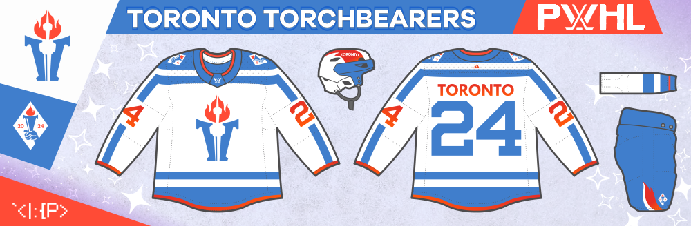
Toronto Torchbearers
I have the hardest time with the "Torch" name, so the best I can do is to adapt it to "Torchbearers." As for imagery, I just place the CN Tower in the flame and torch... The jersey is Toronto flag inspired with its sleeve-length yoke.