Seattle Sonics Logo Concept, October 2019
Here's my take on the return of the Sonics:
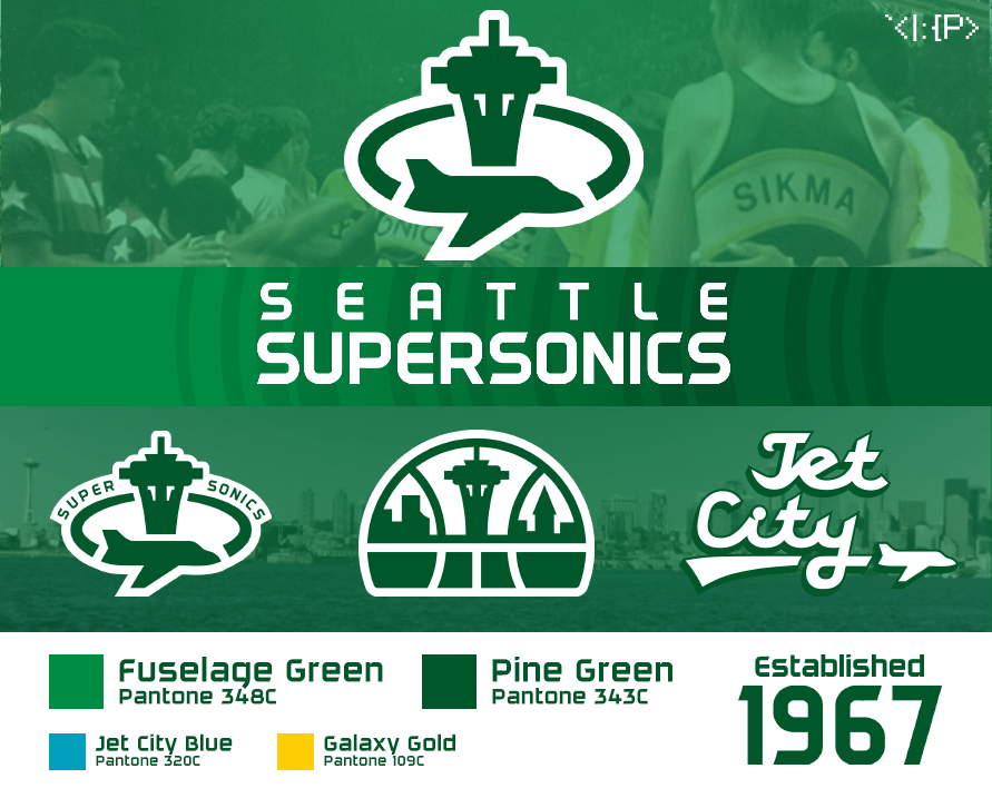
For some reason, the Sonics only ever had one logo with a plane, and even so it was ridiculously small. Here, it's front and center! The primary logo has a motion line around the Space Needle, influenced by the campy '90s logo. The secondary logo is my modernization of the classic skyline logo. The font is modified Daggersquare.
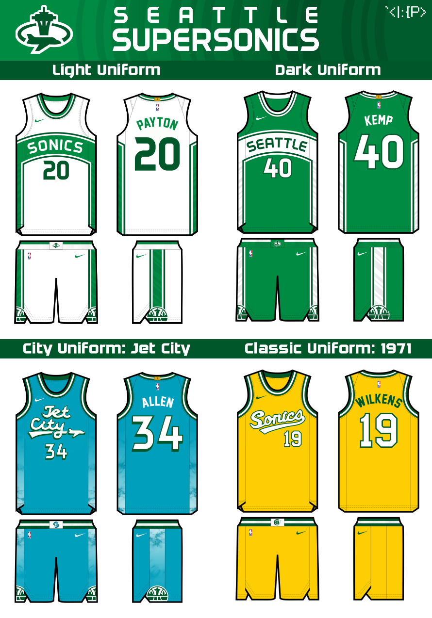
The two main jerseys sport the Sonics' traditional curved stripe + wordmark. The side paneling has a sound wave pattern. The city jersey is inspired by Seattle's aviation history. I think Seattle's "Jet City" nickname would be an apt Sonics response to "Rip City," "Buzz City," etc. The color is from Seattle's flag, with a cloudy sky pattern for the side paneling. Finally, to add some retro yellow to the set, the throwback is the beautiful 1971 jersey.
Thank you for checking it out! SUPER! SONICS!

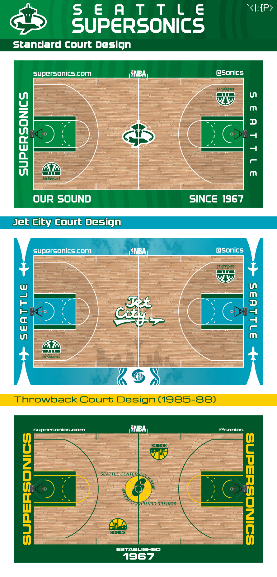
Earlier versions