Seattle Sounders Logo Concept, June 2018
View updated version here!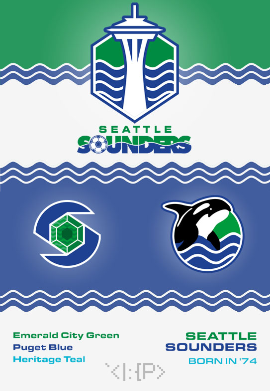 Despite being an enthusiastic fan of the team, I don't particularly like the Sounders' current logo.
Its strangely shaped shields and redundant white & gray outlines feel poorly weighted,
the Space Needle is inaccurately depicted in a gray color, and the banner hogs the spotlight.
Worst of all, though, the current logo doesn't even represent the beloved Puget Sound, the namesake of the team!
I think my concept addresses some of these issues, while also combining the different eras of Sounders logo history.
Despite being an enthusiastic fan of the team, I don't particularly like the Sounders' current logo.
Its strangely shaped shields and redundant white & gray outlines feel poorly weighted,
the Space Needle is inaccurately depicted in a gray color, and the banner hogs the spotlight.
Worst of all, though, the current logo doesn't even represent the beloved Puget Sound, the namesake of the team!
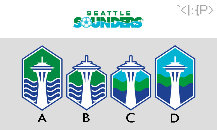
I think my concept addresses some of these issues, while also combining the different eras of Sounders logo history.- Hexagonal, emerald shape
- for the Emerald City's team
- Kelly/emerald green
- to represent emeralds & trees
- Cascadia colors
- blend of greens between old and new Sounders logos
- New Space Needle silhouette
- more accurately colored and shaped
- homage to 1983 logo
- 4 waves in background
- to represent the Puget Sound
- connection to the waves from previous logos
- to represent the Sounders' 4 USL Championships
- Paired with the NASL era wordmark
- using current logo's "Seattle" font
- Two secondary logos:
- an emerald in the Seattle city seal
- the orca whale mascot from the 1990s Sounders logo
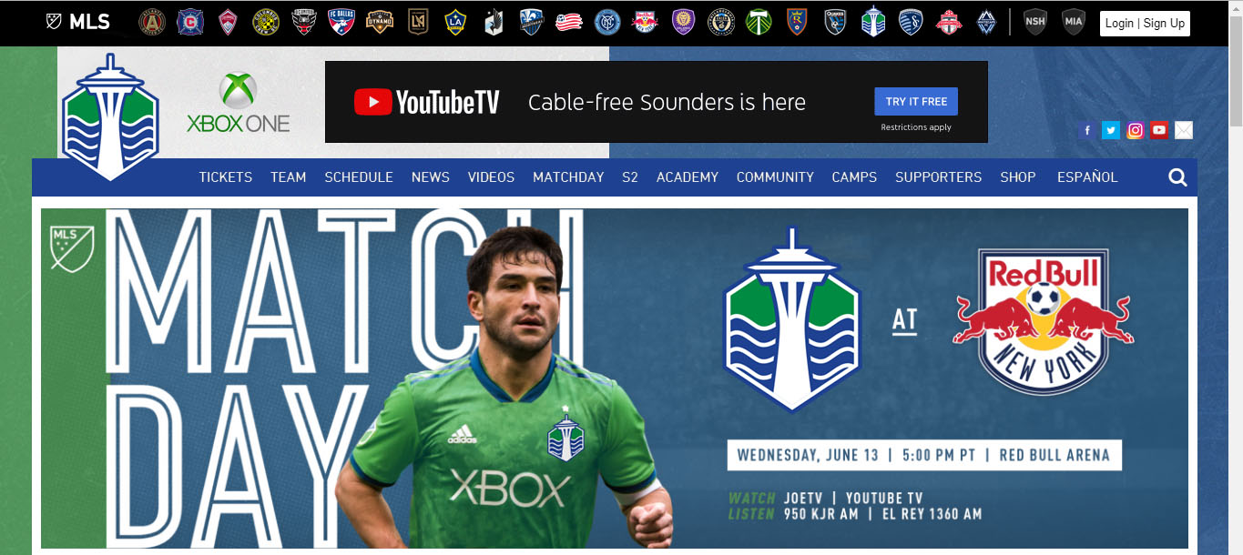
Finally, I mocked up an image of the current Sounders website to show the new logo and new colors.
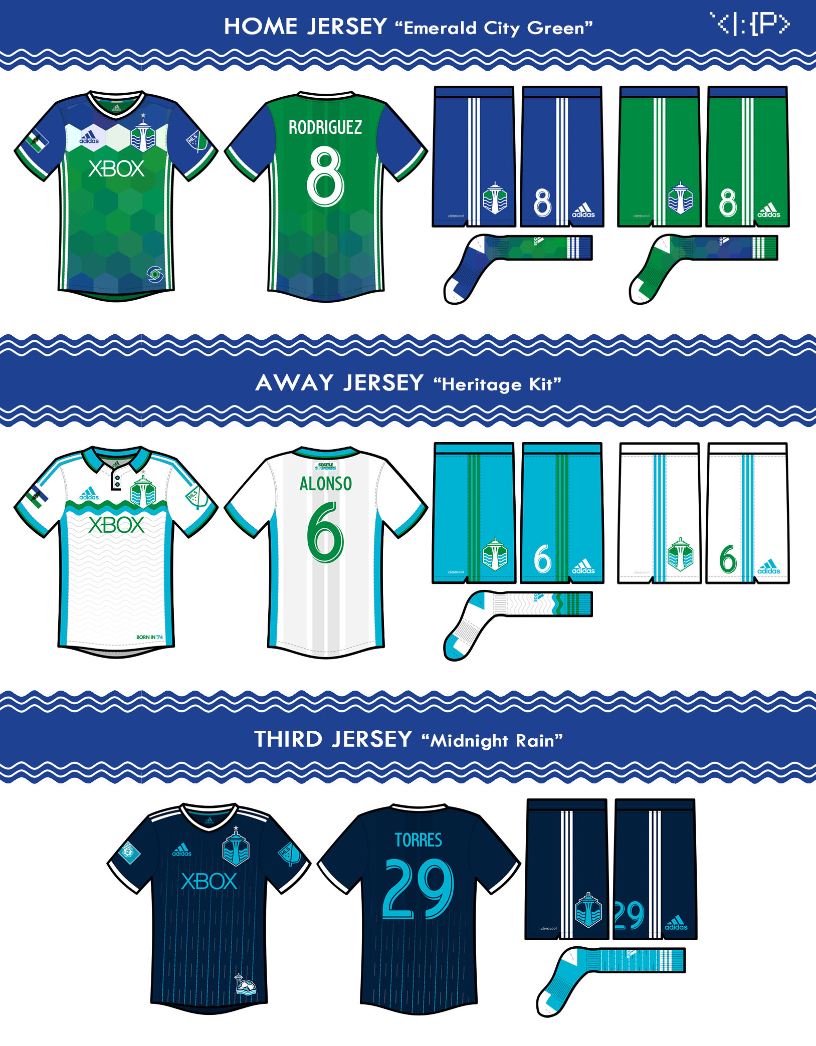
- Home jersey: emerald-like hexagon tessellation
- Away jersey: based on 1981 Sounders jersey, 2017-18 away jersey
- Third jersey: based on 1983 Sounders jersey, Seattle's (in)famous rain
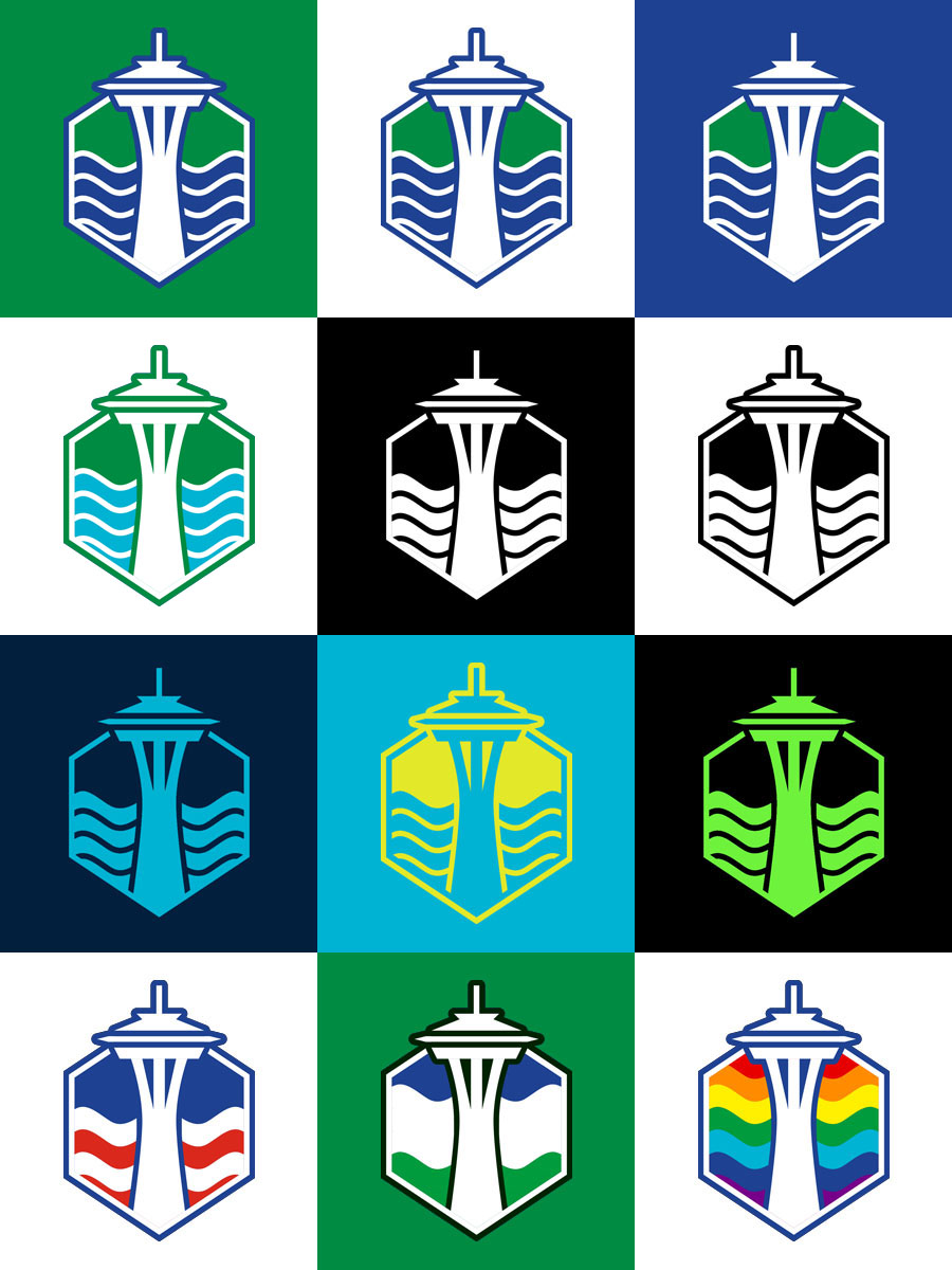
Earlier versions