Seattle Sounders ⭐⭐💎 & Seattle Reign 🛡️🛡️🛡️ Concepts
The Seattle Sounders and Seattle Reign are clearly
the
coolest
soccer teams in existence.
Here are my designs that express my love for the Eternal Blue, Forever Green and the Blue & Bold!
/cdn.vox-cdn.com/uploads/chorus_image/image/57258851/SEA_COL-03810.0.0.jpg)
/cdn.vox-cdn.com/uploads/chorus_asset/file/23439442/SEA_PUMAS_04092.jpg)
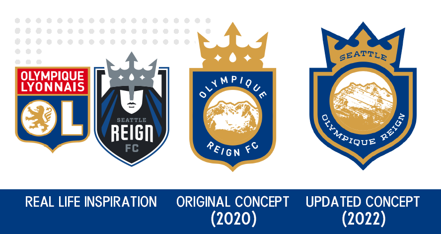
At the time of the creation of these designs, the teams were independently owned. Even then, I often liked to imagine them in branding alignment as if the organizations had already merged.
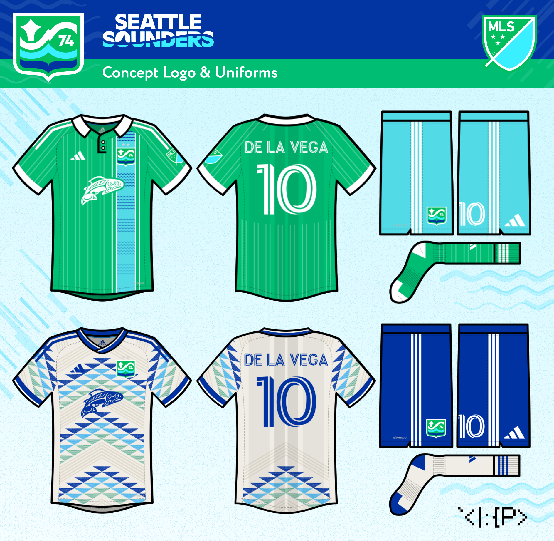
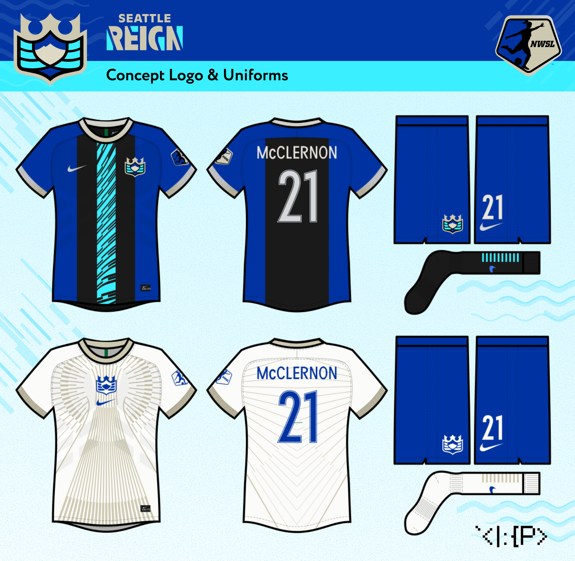
2018–19 — Concept 6
Emerald City Heritage
Emerald City Heritage
2018–2019 (updated 2021)
Concept 6 — Emerald City Heritage
Concept 6 — Emerald City Heritage
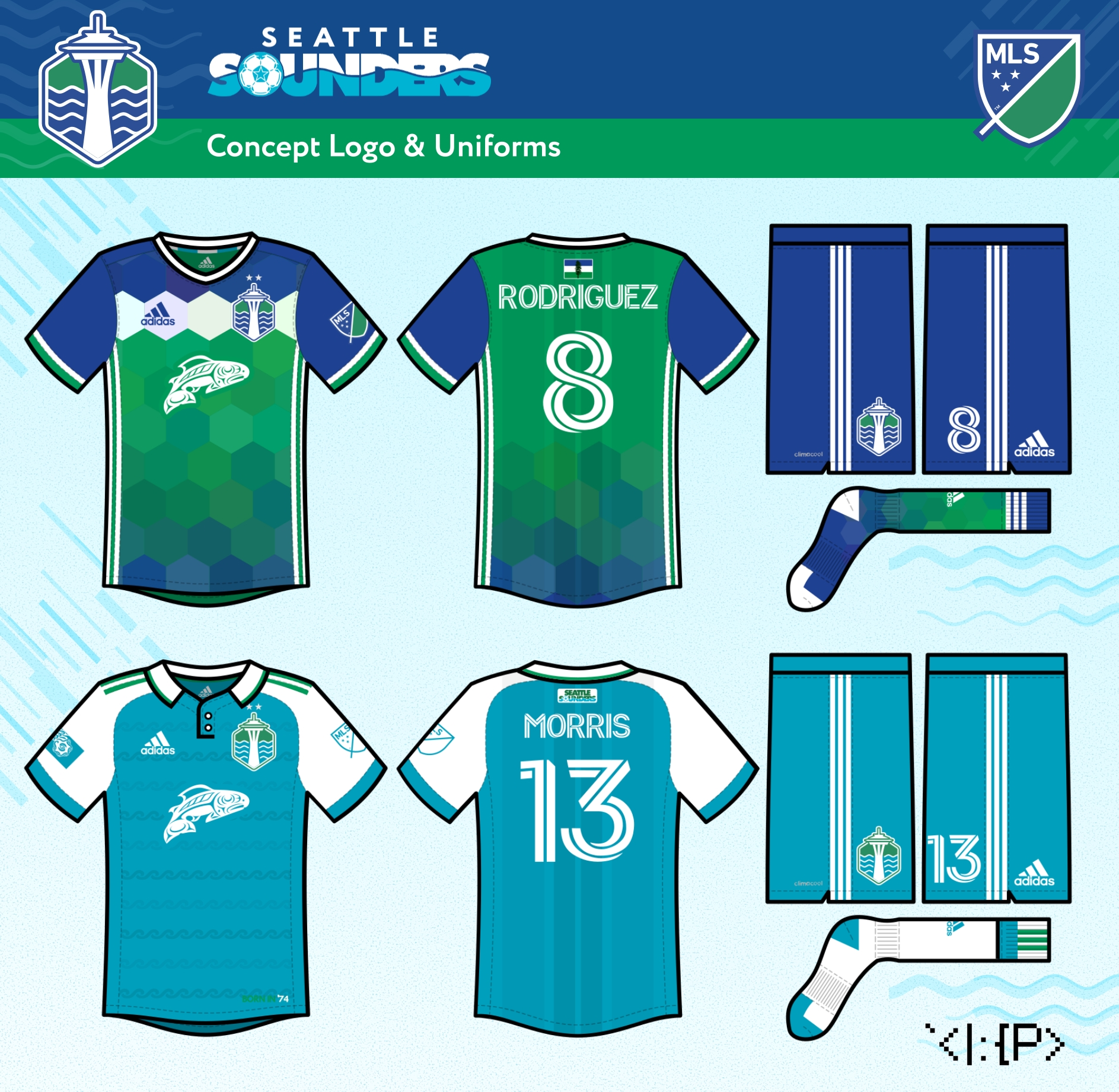
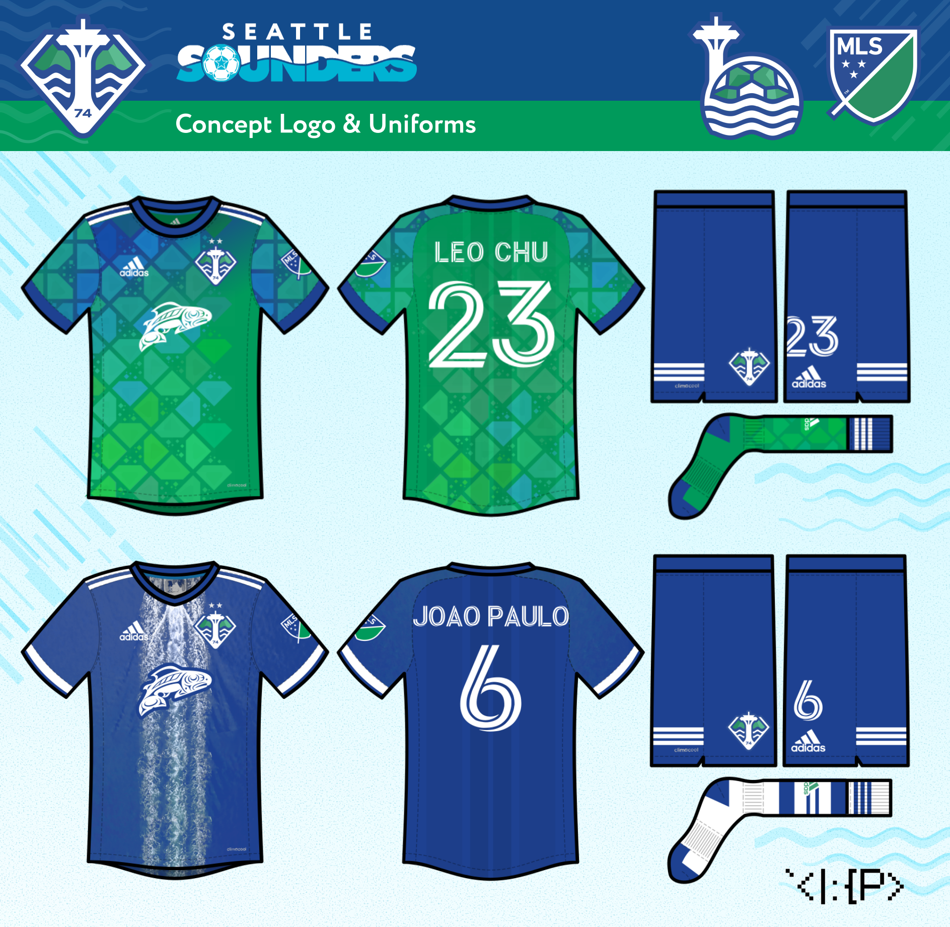
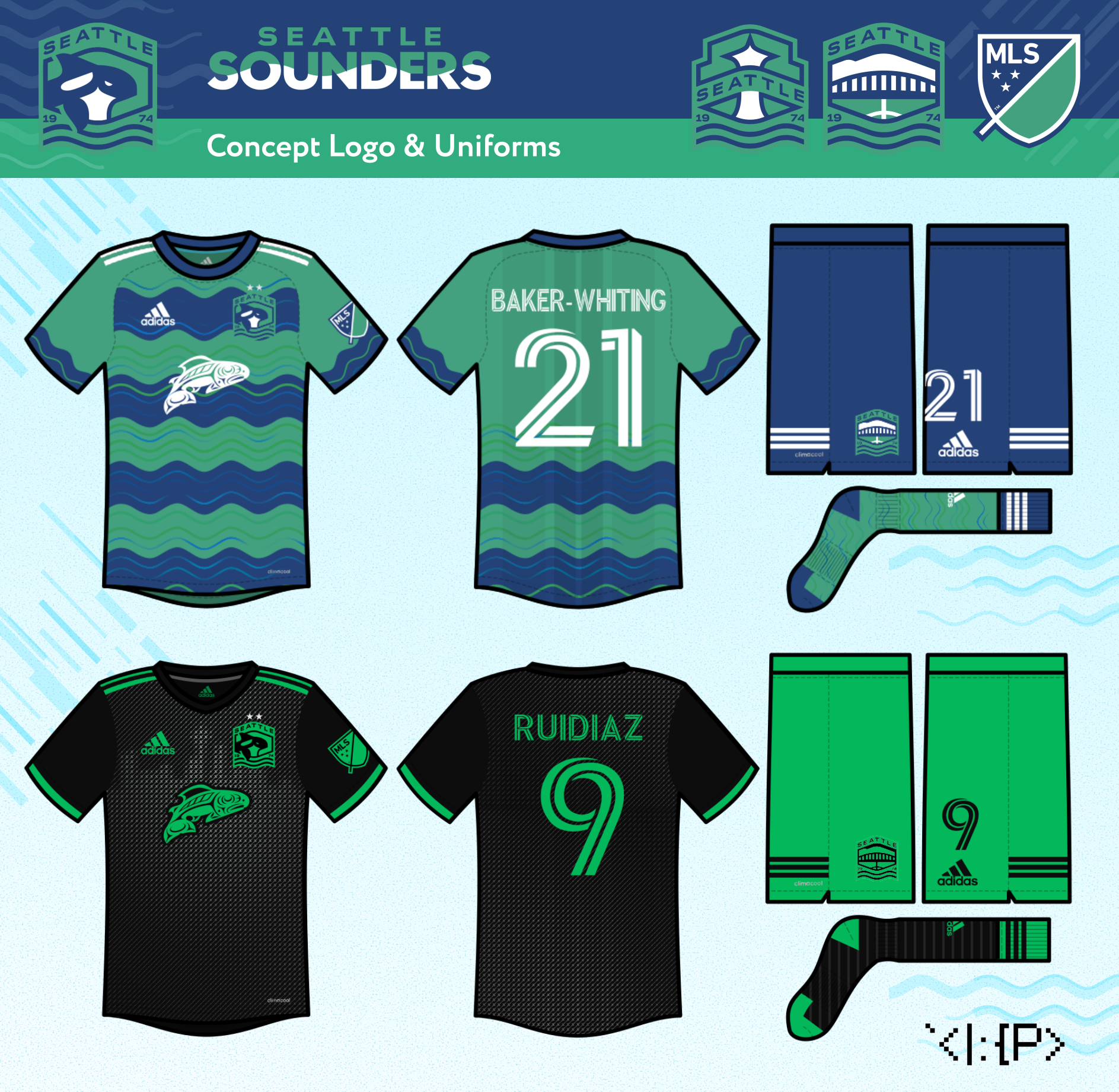
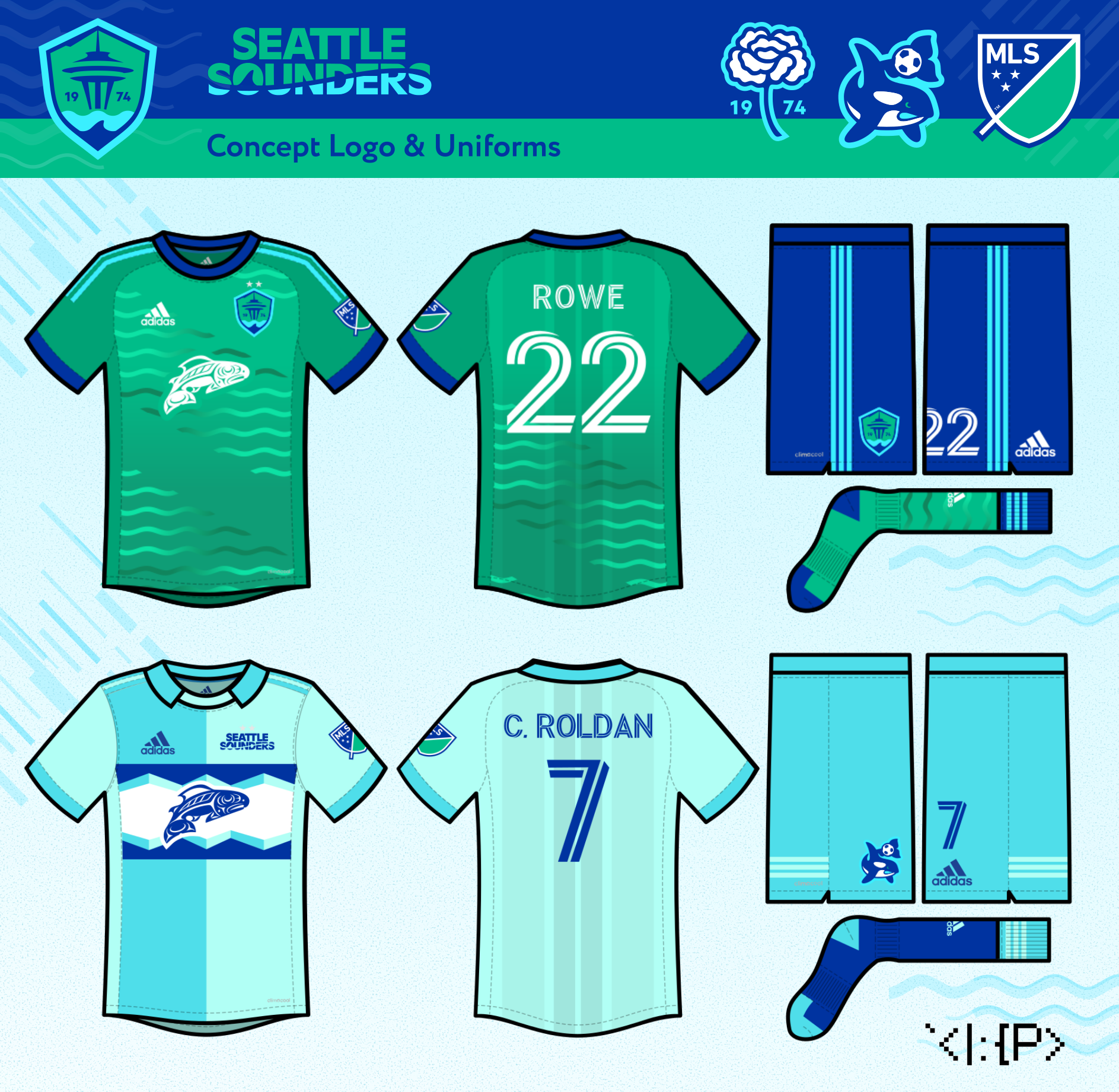
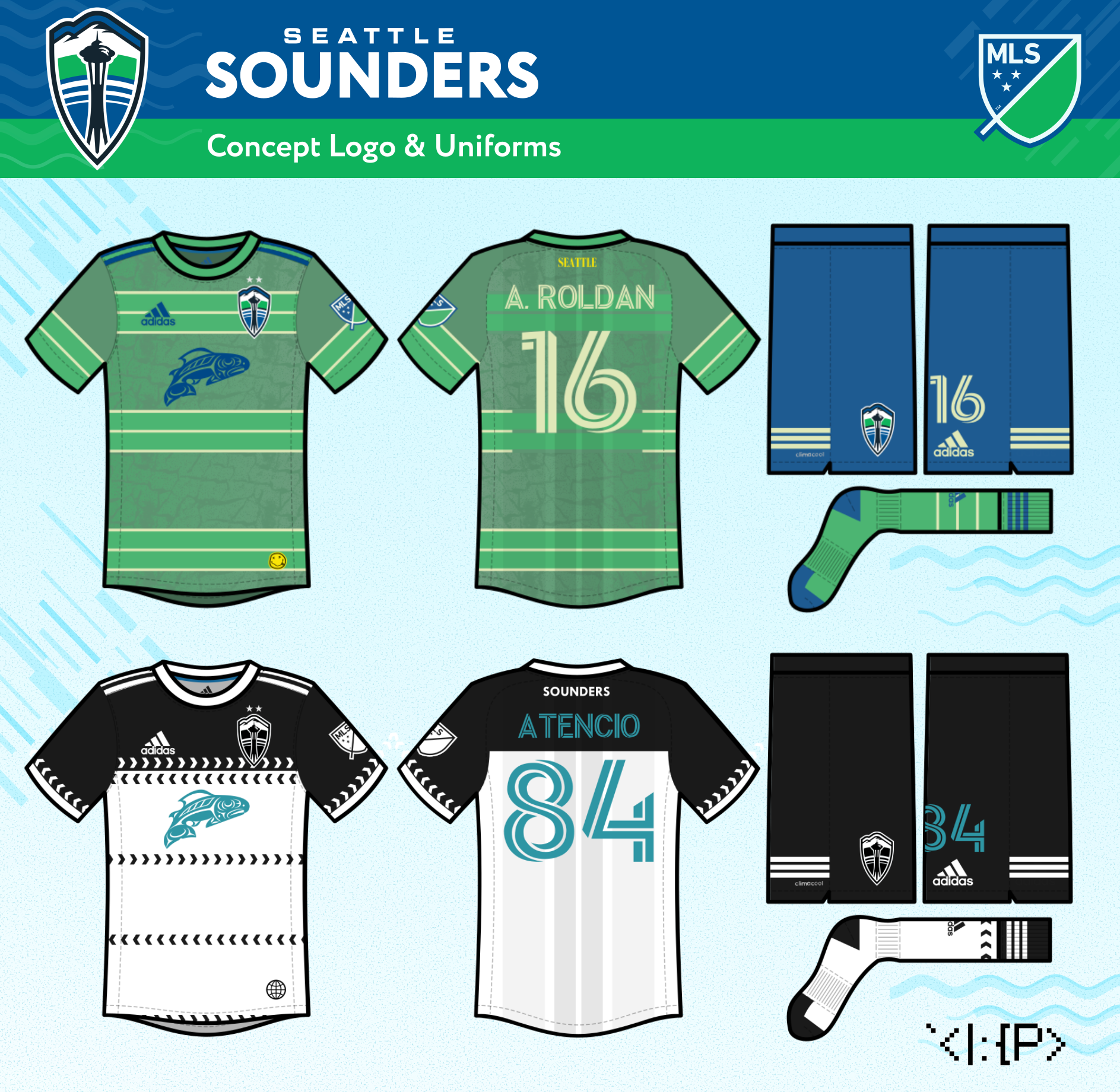
The Sounders logo gets a new Space Needle, done from scratch, inspired by 1983 logo. The 4 NASL-style waves represent our 4 pre-MLS titles. The crest is contained in a hexagonal emerald shape.
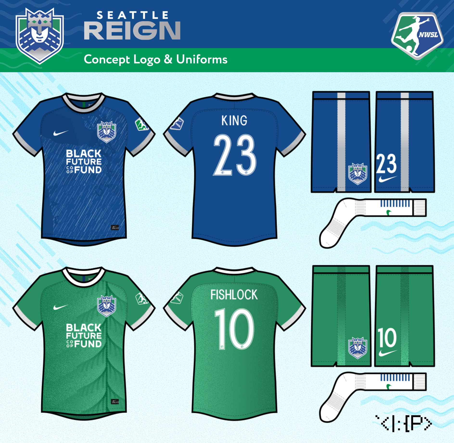
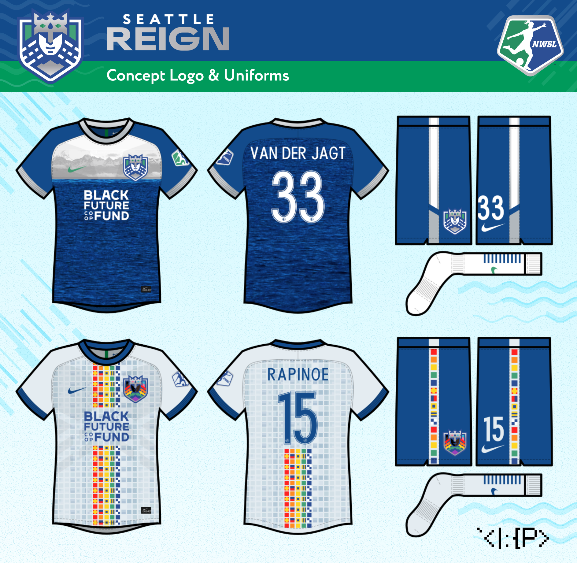
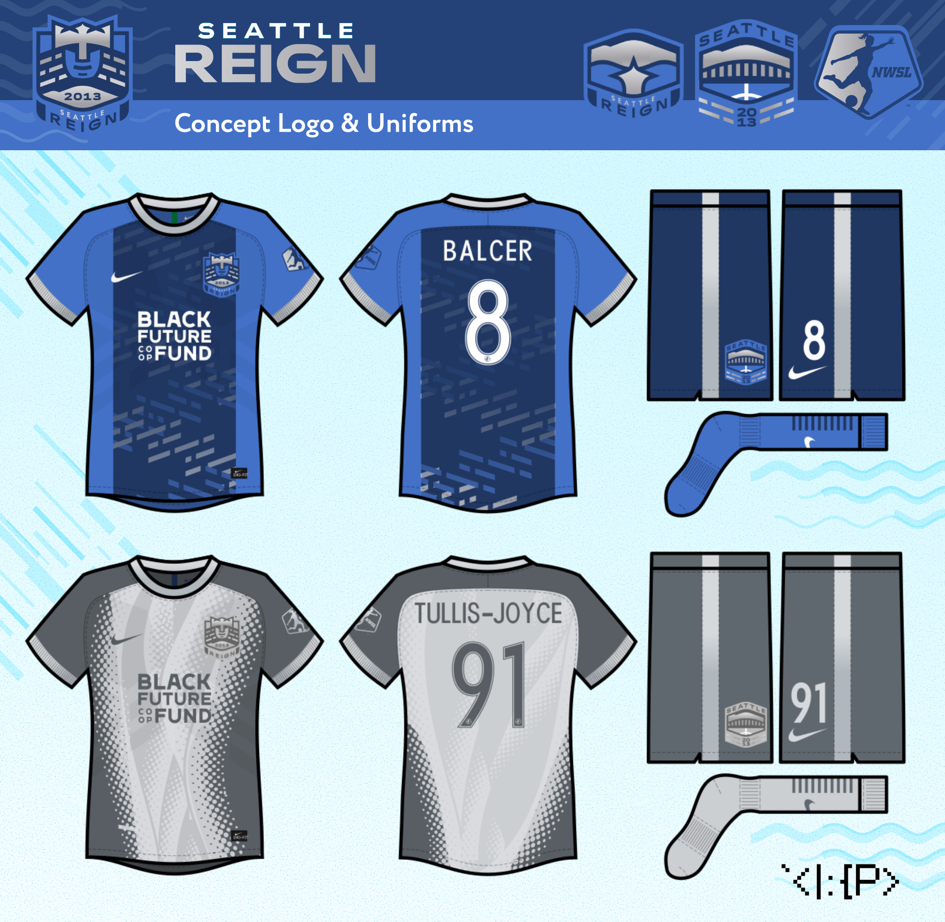
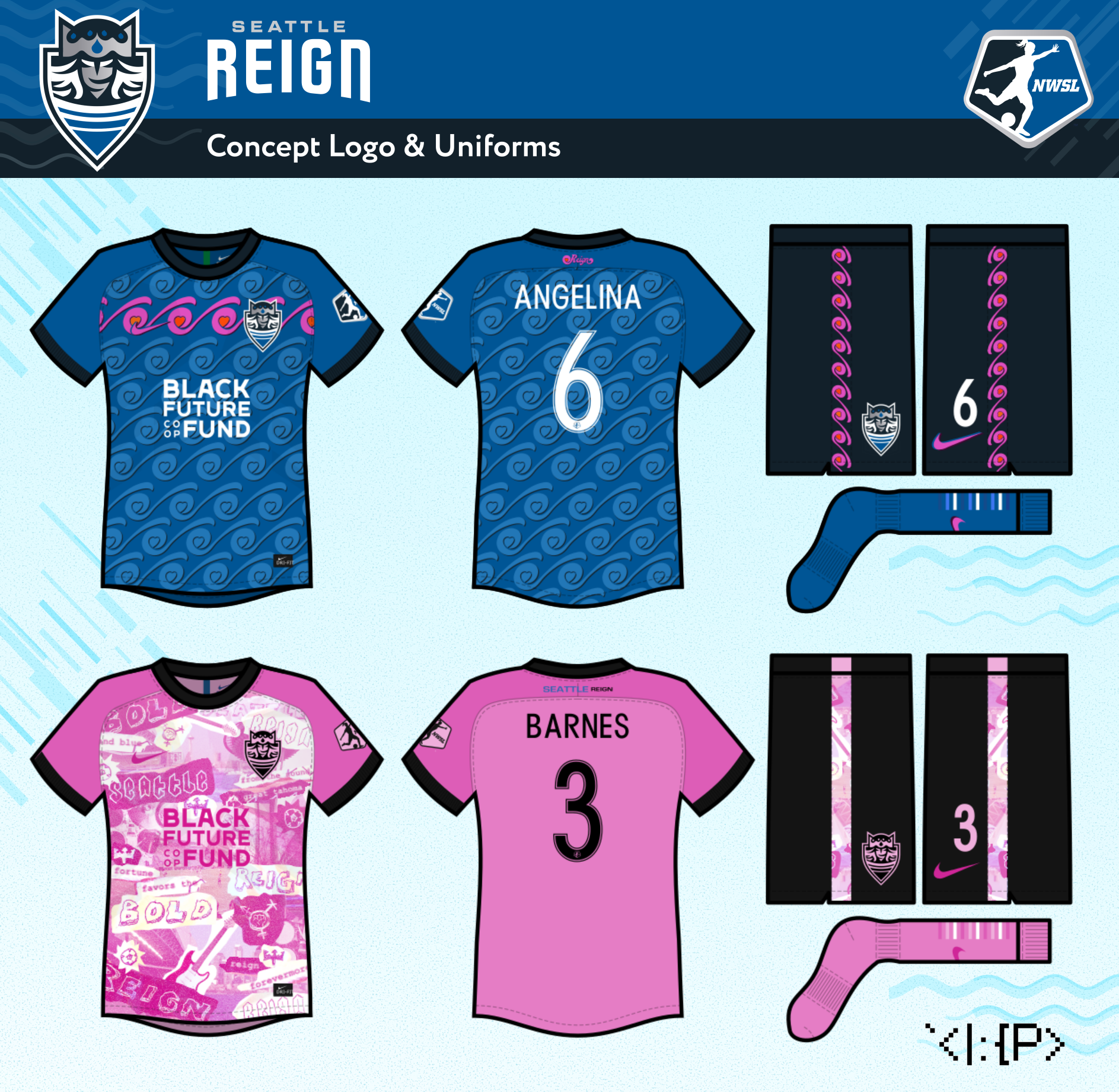
The rain-haired monarch returns from the Reign's inaugural logo, now appearing above the mountains of her domain.
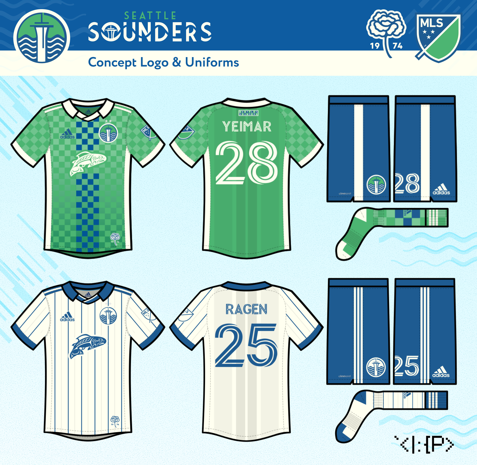
The Sounders home jersey uses a tesselated hexagon pattern to form an
abstract landscape.
The away jersey is a 1982 fauxback design with sublimated waves from the Seattle city flag. (Note: this jersey design predates the very similar Ballard FC jersey!)
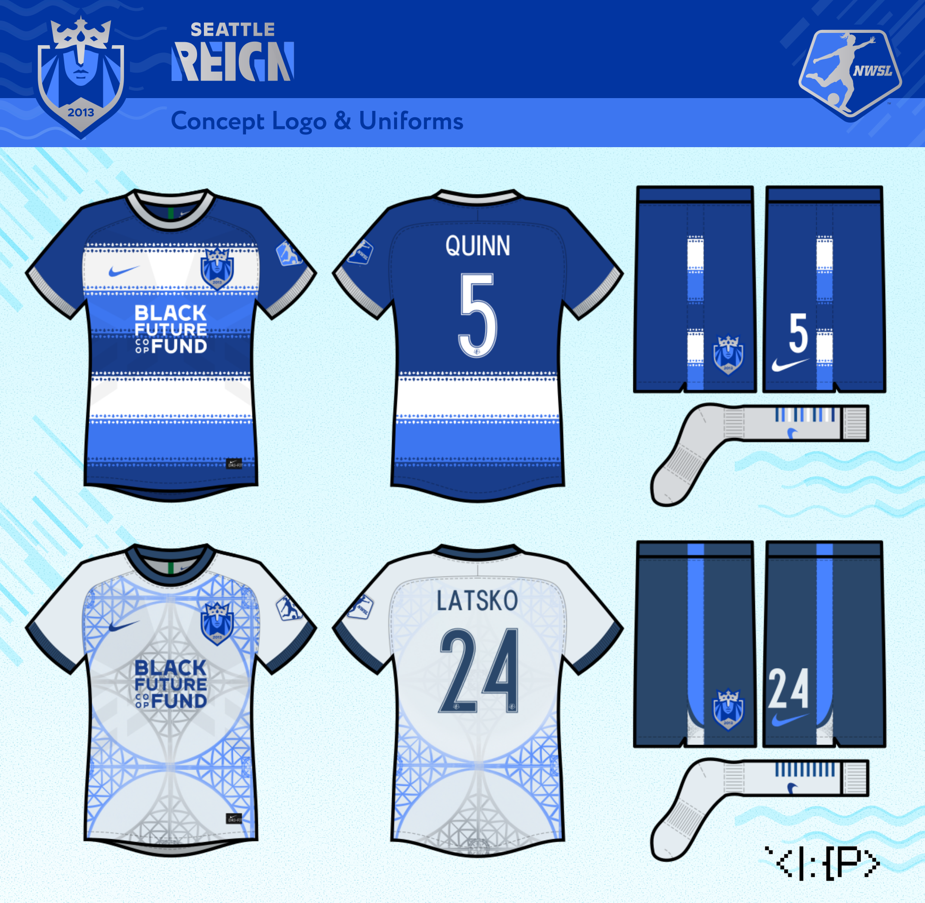
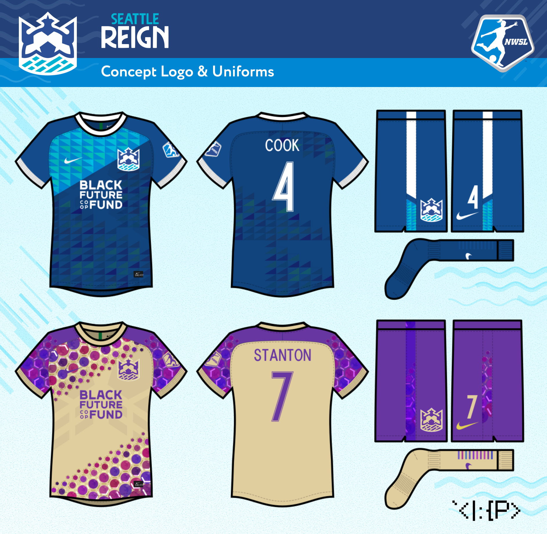
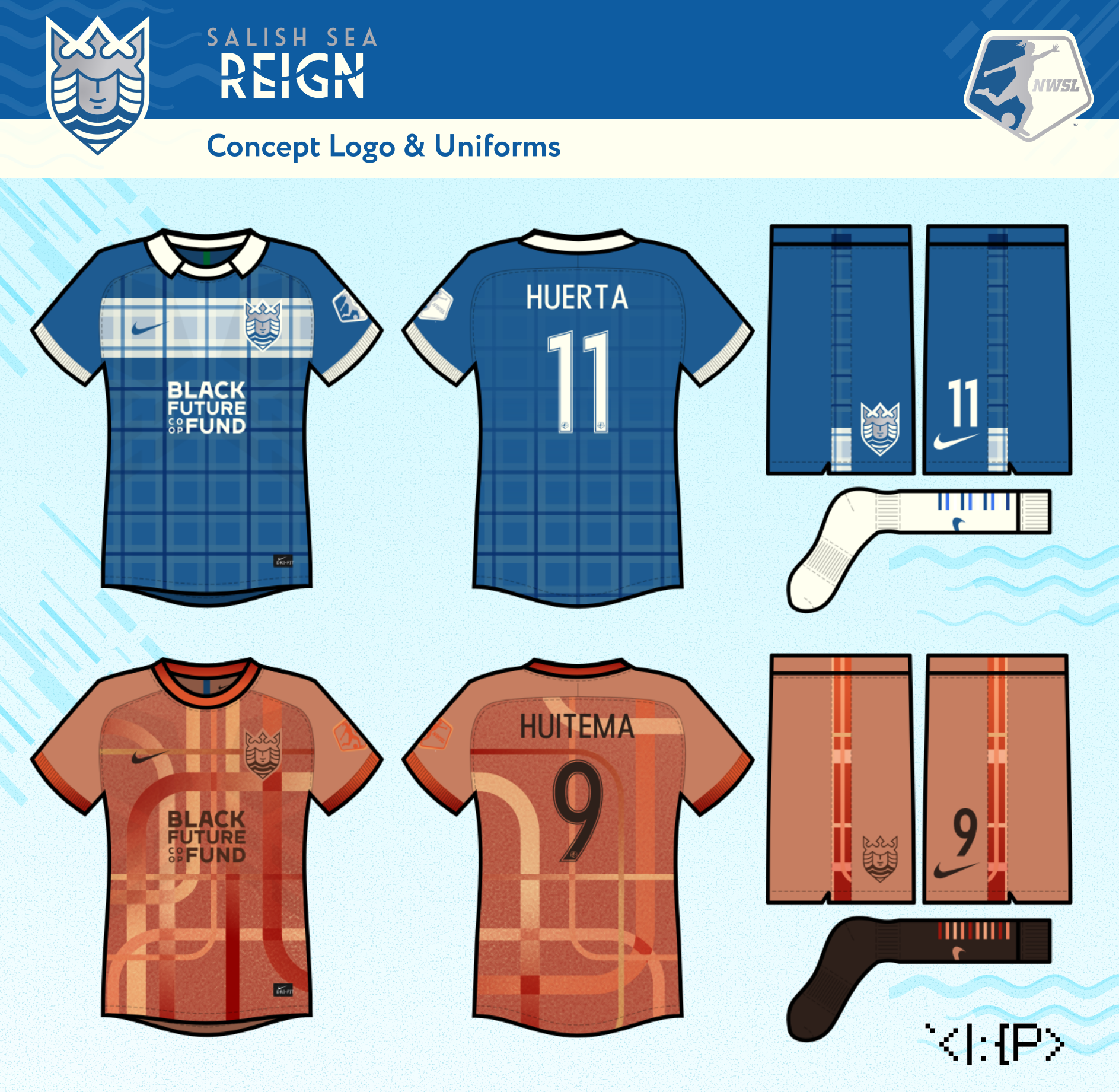
The Reign home jersey puts a rain pattern in the shape of the coastlines of Washington state.
The away jersey incorporates the needles of the native western red cedar into an abstract mountain design.
The away jersey is a 1982 fauxback design with sublimated waves from the Seattle city flag. (Note: this jersey design predates the very similar Ballard FC jersey!)
/cdn.vox-cdn.com/uploads/chorus_asset/file/23081711/939A1672_830D_4743_8F5C_6BDFFC7FC176.png)
The Reign home jersey puts a rain pattern in the shape of the coastlines of Washington state.
The away jersey incorporates the needles of the native western red cedar into an abstract mountain design.
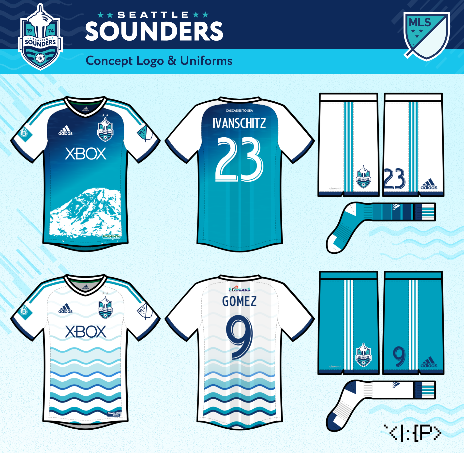
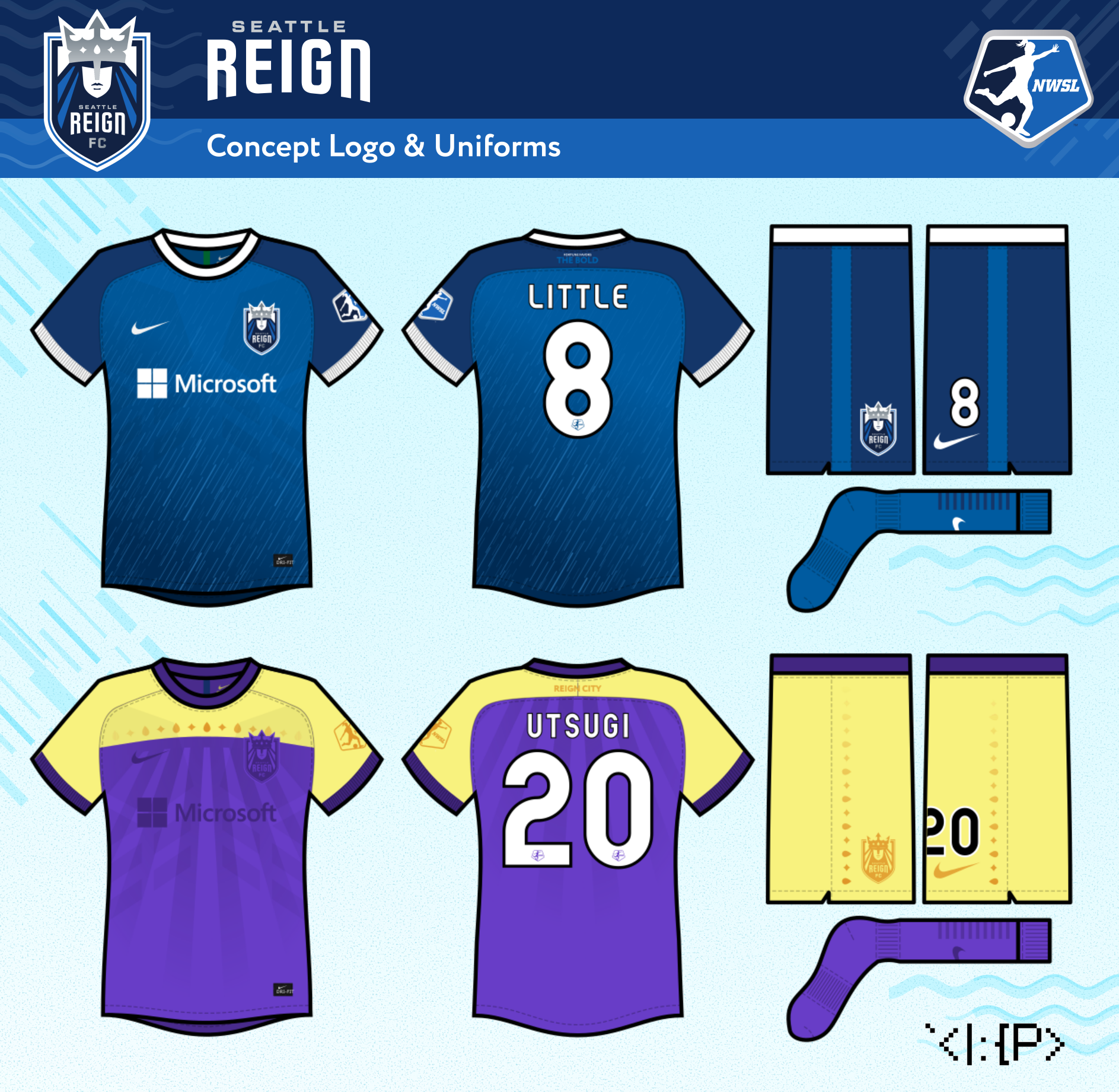
2022 — Concept 6.5
Gem of the Emerald City
Gem of the Emerald City
2022
Concept 6.5 — Gem of the Emerald City
Concept 6.5 — Gem of the Emerald City
At home, the Sounders sport a tesselated pattern of sparkling gems on a blue-green gradient.
Away, the team wears a loose 2006 throwback, with the center stripes formed by the wake of a ferry.
The Reign get a photograph of the Olympic Mountains over the Sound at home. A simple idea that surprisingly hasn't been used yet in Seattle soccer!
On the road, a vertical stripe alternates between "REIGN" nautical flags and Pride flags.
2022 — Concept 7
Forces of Nature
Forces of Nature
2023
Concept 7 — Forces of Nature
Concept 7 — Forces of Nature
Sounders fans seem divided about if the team should return to
the '90s orca, depict Tahoma, or keep the Space Needle, so I wanted to
see if I could design a
logo with all of the above!
The orca appears above the team's classic waves in front of the silhouette of Tahoma, and hides an abstract Space Needle on its belly (à la Kraken.)
The same Space Needle render appears in the Reign's crown, with the same Tahoma render below the monarch.
The orca appears above the team's classic waves in front of the silhouette of Tahoma, and hides an abstract Space Needle on its belly (à la Kraken.)
The same Space Needle render appears in the Reign's crown, with the same Tahoma render below the monarch.
Click the logos below to see animated versions!
The away is based on the 2014 third nicknamed "Nuclear Orca" by fans, but with an added Seattle skyline pattern in diagonal pinstripes.
A 2014 fauxback for the Reign at home, but with rain patterning from the crest.
On the road, the team sports a harbor porpoise-inspired monochrome jersey.
2023 — Concept 8
50th Ann. Brand Tweak
50th Ann. Brand Tweak
2023
Concept 8 — 50th Anniversary Brand Tweak
Concept 8 — 50th Anniversary Brand Tweak
The NASL wave and orca, which are included in the IRL brand package as secondary logos only, are now both integrated as elements in the primary logo and wordmark for a more cohesive set.
I additionally imagine a synergistic Reign logo in case the upcoming sale of the NWSL team goes to their MLS co-tenants.
On the away is an aqua jersey with a hoop inspired by the 1994 home jersey's sleeves.
At home, the Reign boast a barberpole design inspired by our 2015 training top, with logo elements as a pattern.
On the road Reign jersey, I use an ant's-eye view of the famous arches at the team's old neighbor, the Pacific Science Center.
2025 — Concept 9
Salish Sea Logo Tweak
Salish Sea Logo Tweak
2025
Concept 8 — Salish Sea Logo Tweak
Concept 8 — Salish Sea Logo Tweak
The Sounders home jersey is my take on the vertical stripes design of the IRL jersey, shifted to be a bit closer to the 1983 home. The away is the new IRL away, but with shifted colors to match a picture from the jersey rollout.
The Reign home is another 2014-inspired design with some rain designs to incorporate the new light blue, and the away is based on the new IRL away, changed to make the Space Needle inspiration more clear.
2016 — Concept 1
Unified Shield
Unified Shield
2016 (recreated 2023)
Concept 1 — Unified Shield
Concept 1 — Unified Shield
The Sounders logo retains the current logo's Space Needle and text treatment, while reintroducing 1974 / NASL-era waves and ball. The four stars represent our four pre-MLS titles ('95, '96, '05, '07).
Since the Reign are a double-blue team, the Sounders revert to the blue & teal team colors used in 1983 and 1994–2002. These jerseys are recreations of designs from 2016, some of my earliest soccer designs, which I originally made using this strange Paint template.
The Sounders get a gradiented home jersey featuring Tahoma (aka Mt. Rainier) and an wavy away jersey. (Original: Home, Away)
The Reign uses a rainy double-blue home jersey, and a take on our 2015 third jersey with logo-inspired patterning for the away. (Original: Home, Away)
2016–23 — Concept 2
Spirit of '83
Spirit of '83
2016–2023
Concept 2 — Spirit of '83
Concept 2 — Spirit of '83
For the Reign, I created a matching crown version with rainclouds instead of waves.
Original 2016
The Sounders' change kit shows a Washington State Ferry in the inaugural NASL colors.
A triangle pattern adorns the home Reign uniform.
On the road, the Reign wear a jersey inspired by the skylights of Underground Seattle.
2016–23 — Concept 3
Sound Waves in Motion
Sound Waves in Motion
2016 (updated 2022)
Concept 3 — Sound Waves in Motion
Concept 3 — Sound Waves in Motion
Then, in 2022, James Woollard (official stadium announcer for the Sounders) posted my design on Twitter, leading him, Jasmine, and myself to all riff on the design until reaching the Sounders logo you see here. Check out the graphic below to see all of those designs.
The Reign logo I designed myself to match, with the monarch's face and hair being hidden in mountains, and the crown forming a raincloud. For this set, both teams get music-inspired jerseys in the vein of the Sounders' IRL Hendrix kit.
The Sounders get a home Nirvana kit inspired by Kurt Cobain's famous sweater from the Smells Like Teen Spirit video, and a black & white Sub Pop away kit.
The Reign wear a home jersey with a wave pattern inspired by Heart's logo, and a pink punk-aesthetic away kit as tribute to the Riot Grrrl movement.
2017–19 — Concept 5
Classically Cascadian
Classically Cascadian
2017–2019 (updated 2023)
Concept 5 — Classically Cascadian
Concept 5 — Classically Cascadian
The monarch on this Reign logo, which I made in 2019, is incorporated into mountains, with cresting waves underneath. I came up with the "Salish Sea" moniker during the stint in Tacoma, since I felt the team should still have a location in its name.
Both teams use the Market Deco font from the Pike Place Market sign.
For a classic look, the Sounders wear two fauxbacks.
At home, a 1978 fauxback with a streamlined take on the checkerboard from the current 2022 jersey. On the road, a simple pinstriped 1983 fauxback.
The Reign go plaid for the home jersey, with the hoop from our inaugural home jersey.
For the road, we go with a Gasworks Park-inspired jersey.
Other Related Concepts
Sounders 2019 Season Ticket Holder Scarf
I'm honored that my design was selected by the season ticket holders as the Sounders Alliance's
annual scarf design contest for 2019! (2018)
2020–22
Olympique Reign
Olympique Reign
2020–2022
Olympique Reign Concept
Olympique Reign Concept
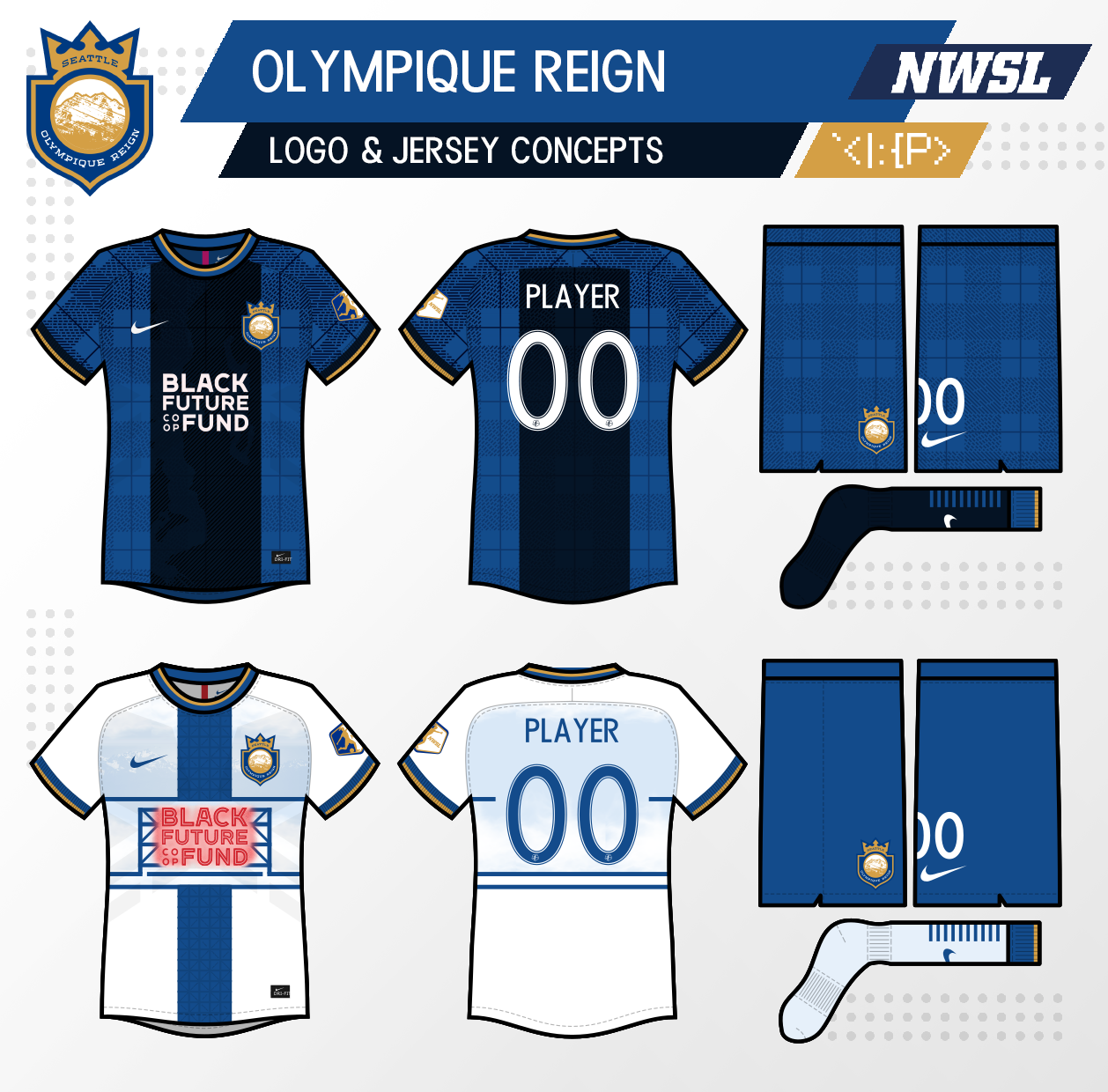
While I'd rather they kept the old logo, I wanted to try to find a better way to combine the Lyon and Reign brands than the actual design.
My new crest takes the shape and colors of the OL logo, but adds the Reign crown, and incorporates the "Olympique" moniker by showcasing the nearby Olympic Mountains.
The home jersey becomes a fauxback to the 2014 home jersey with the blue base and black center stripe.
A Puget Sound map appears in the black section, incorporated into a plaid raindrop design.
I love the all-time list of Reign players on the new IRL away jersey, but sadly it appears on a design that says Lyon more than it says Seattle. Thus, my updated away jersey incorporates those names into a Pike Place Market-themed jersey. The ad becomes part of the famous neon sign, and the player names on the stripe are placed onto the market's floor tiles (which also feature names). Lastly, the Olympic mountains remain in the background from my old version.
I love the all-time list of Reign players on the new IRL away jersey, but sadly it appears on a design that says Lyon more than it says Seattle. Thus, my updated away jersey incorporates those names into a Pike Place Market-themed jersey. The ad becomes part of the famous neon sign, and the player names on the stripe are placed onto the market's floor tiles (which also feature names). Lastly, the Olympic mountains remain in the background from my old version.
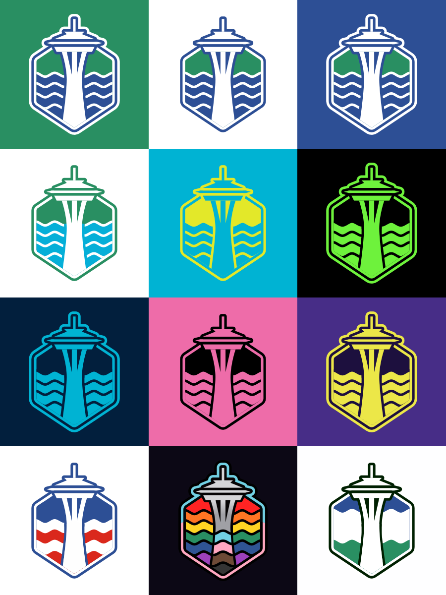
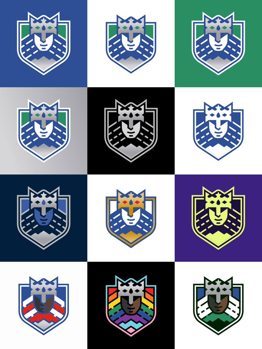
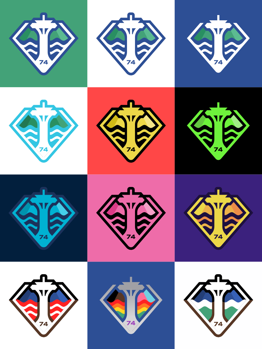
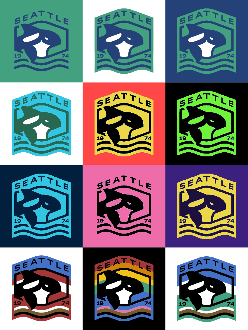
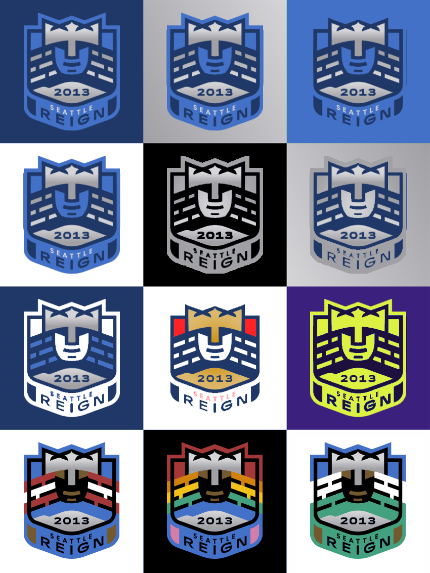
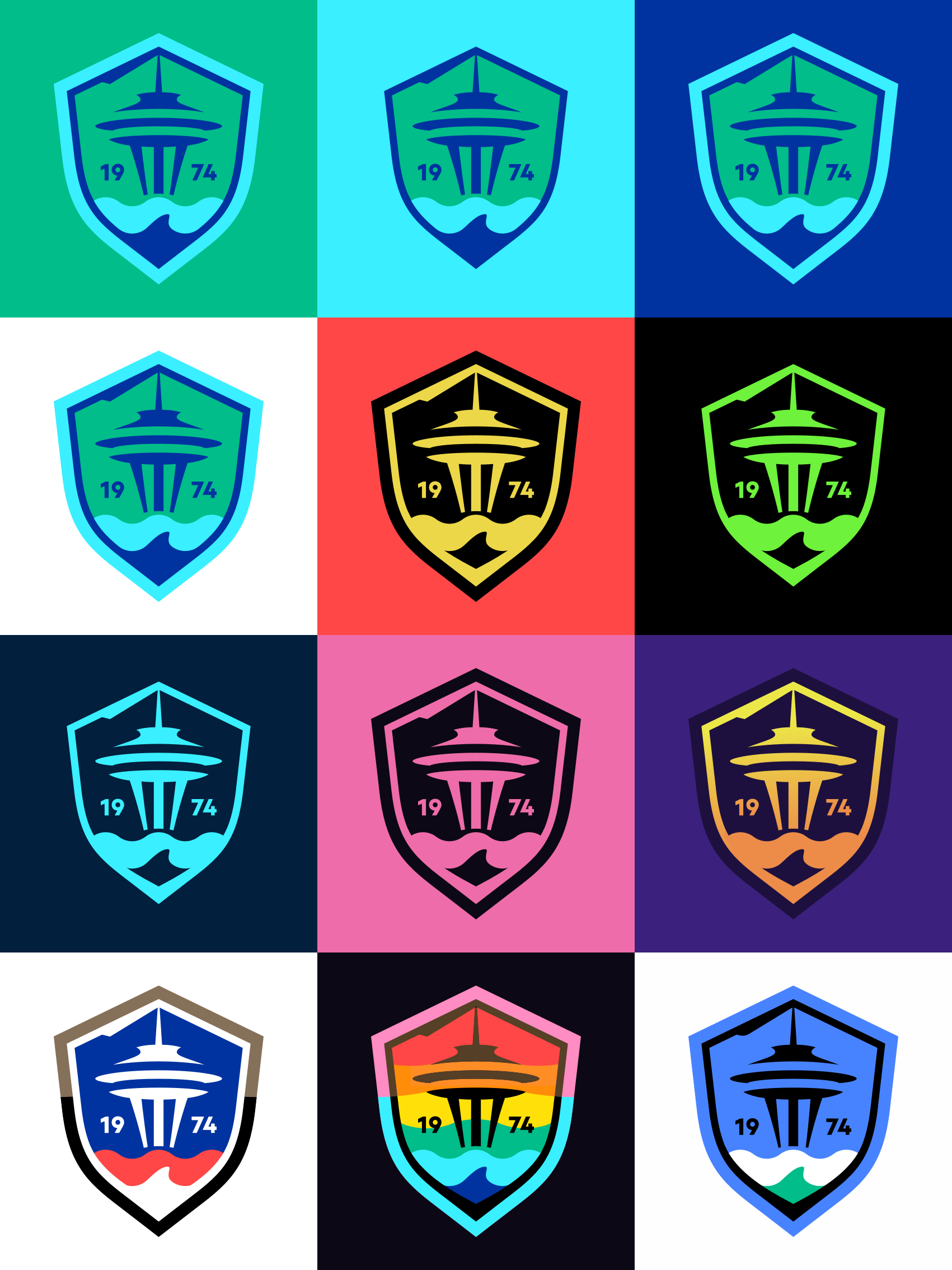
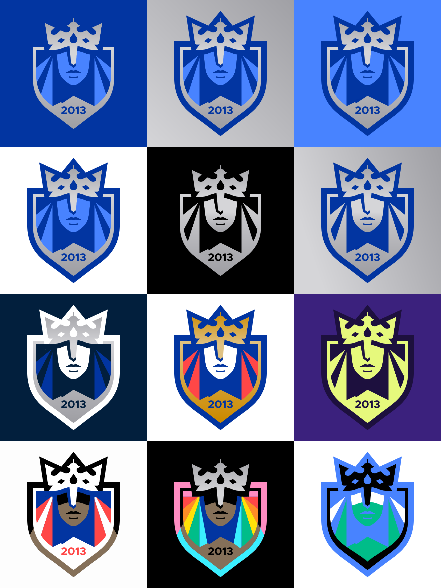
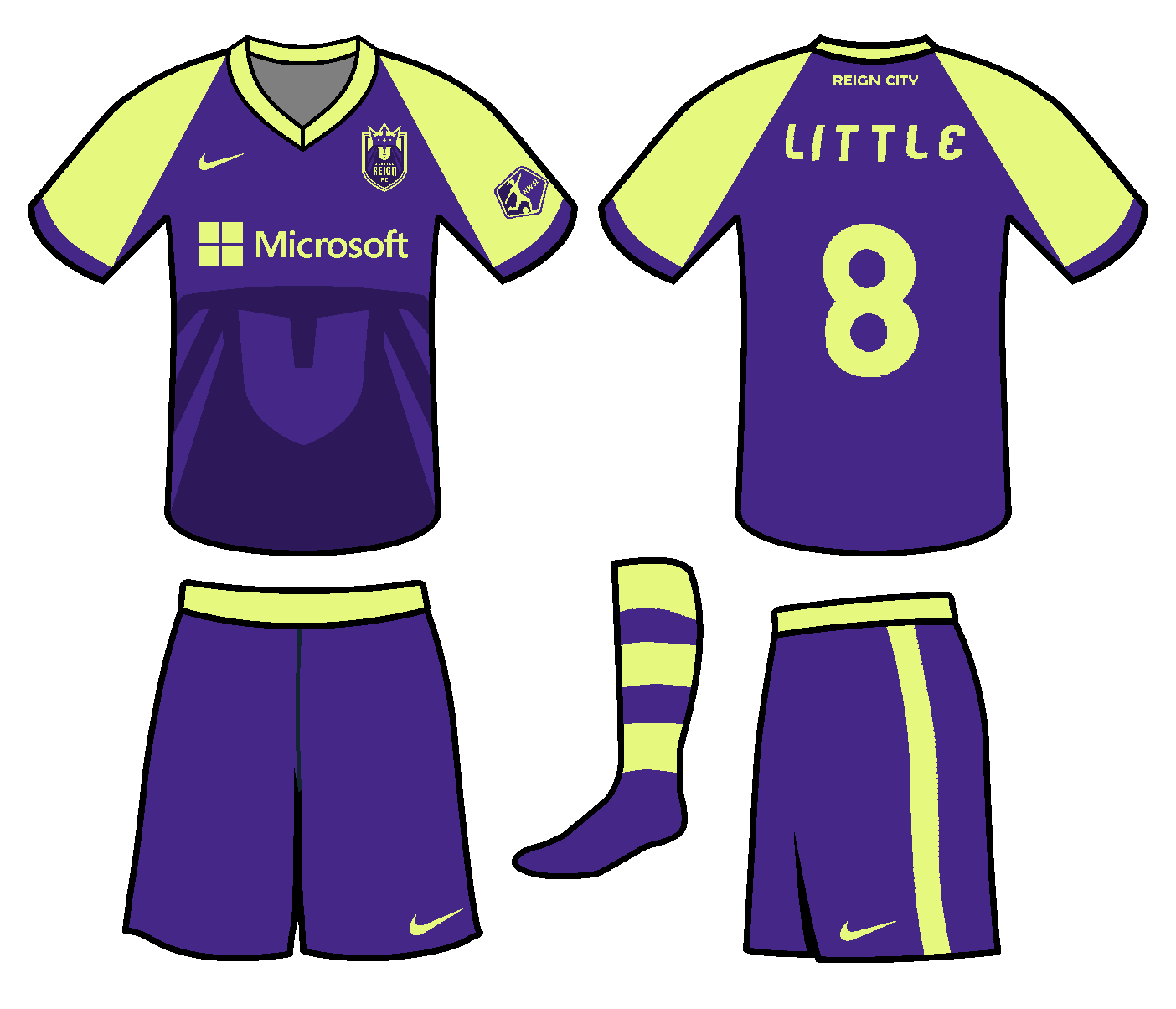
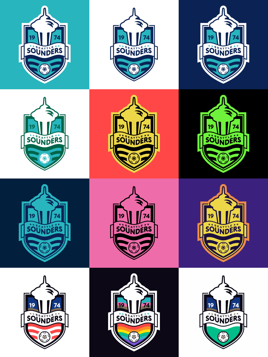
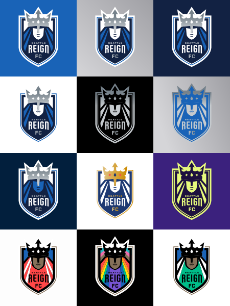
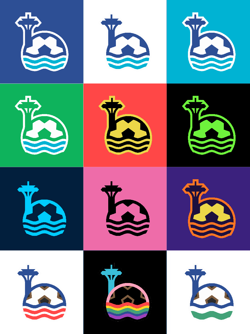
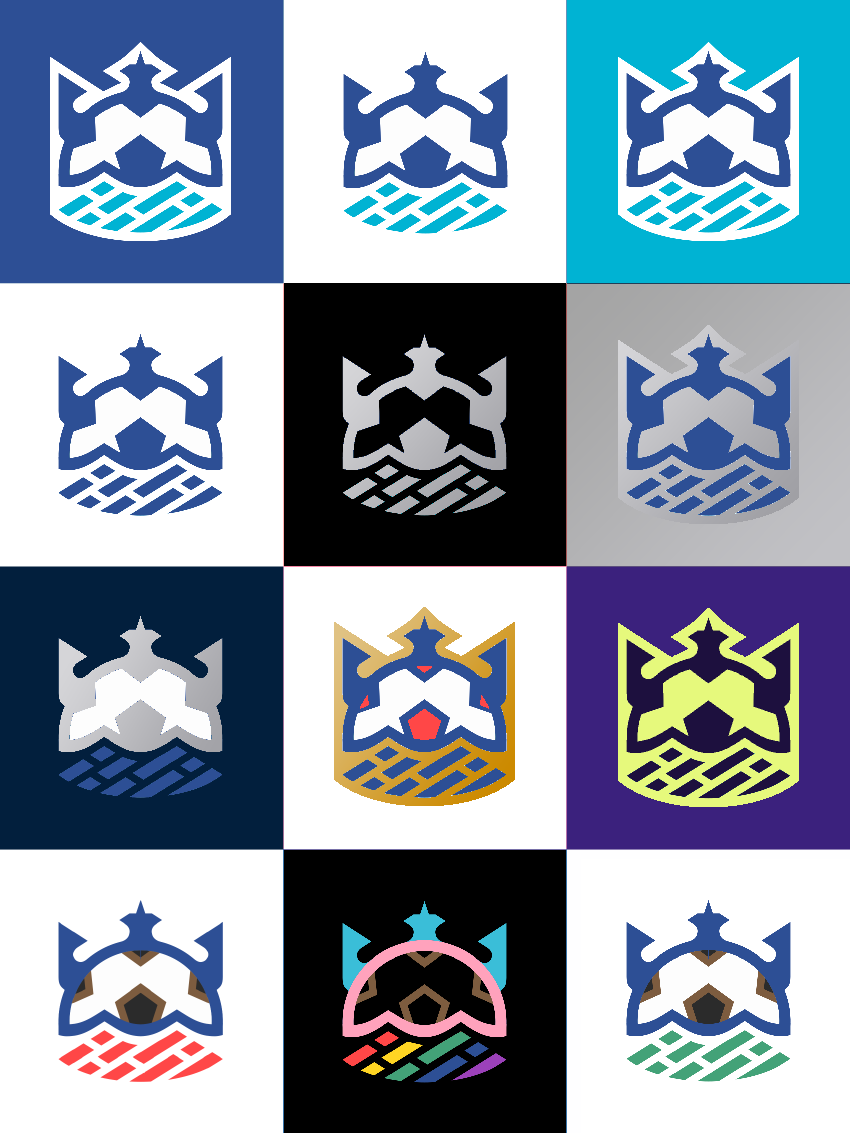
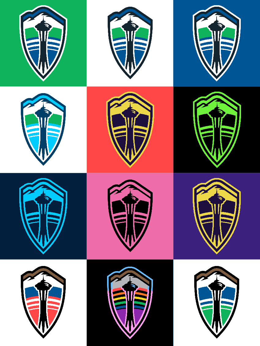
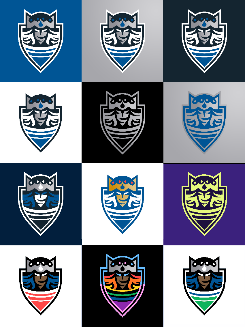
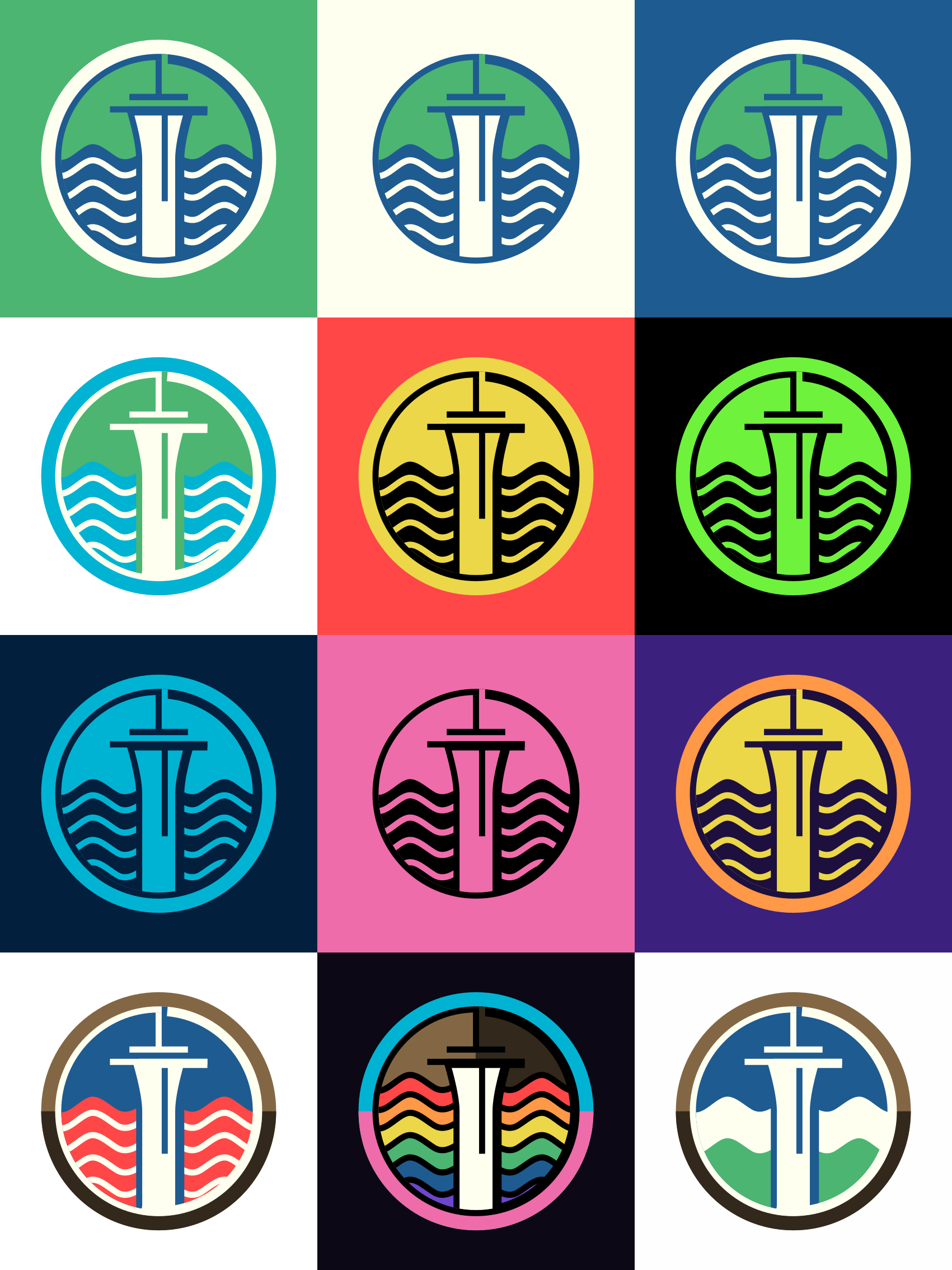
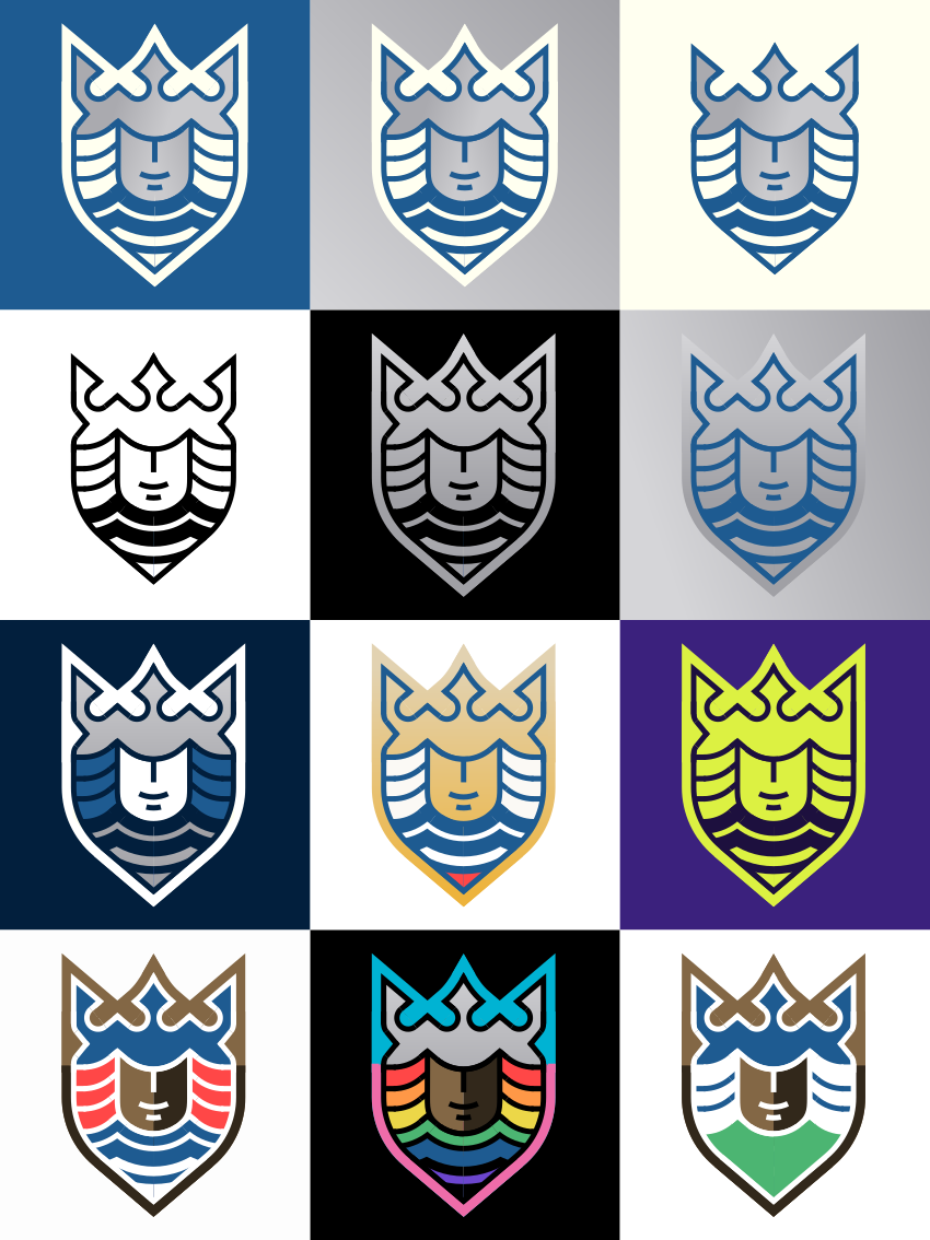
 The color variations show all the color schemes used by each team's
alternate jerseys, retro color schemes, and holiday color schemes for
July 4th, Pride Month, and Cascadia Day.
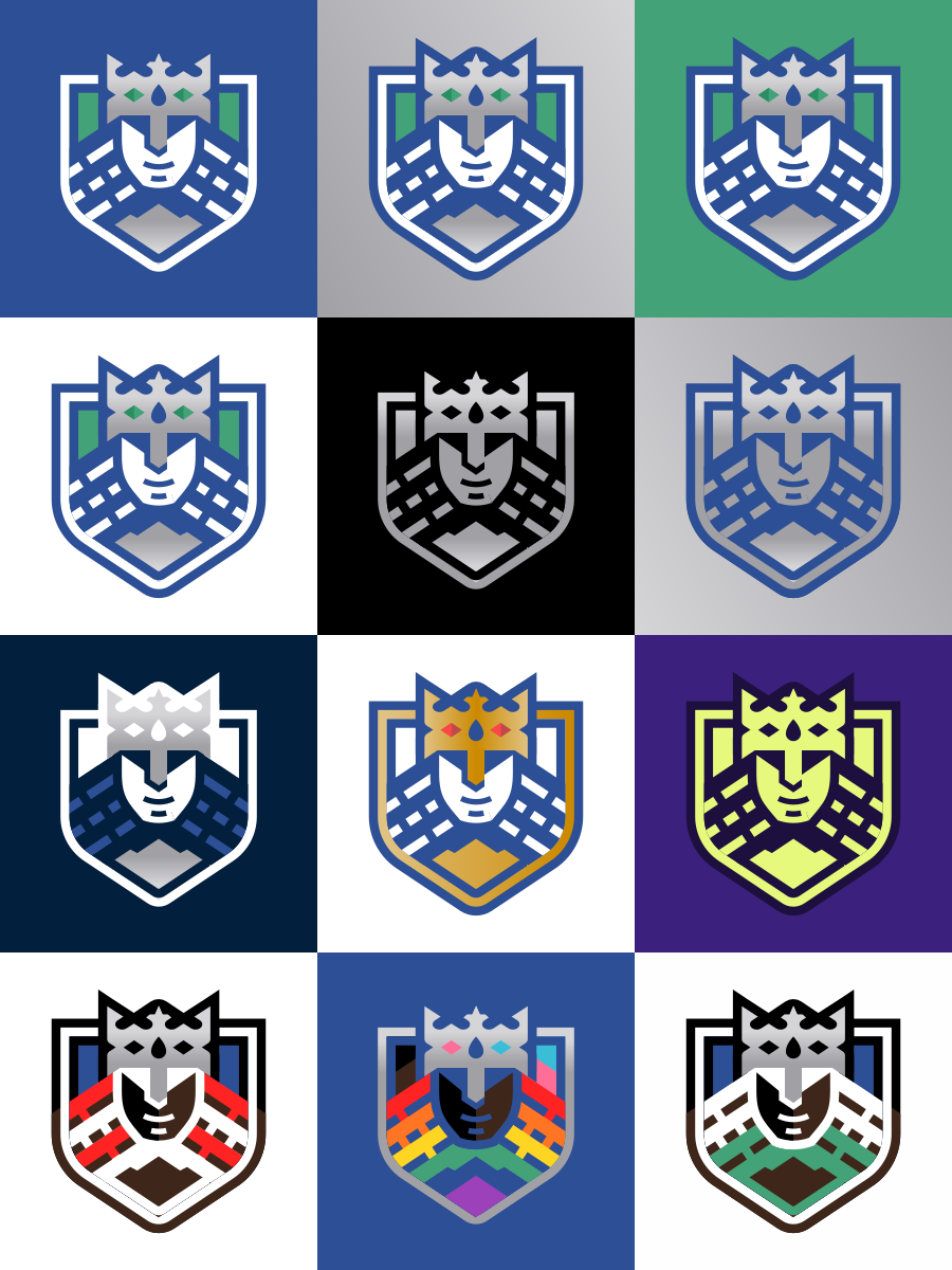
The color variations show all the color schemes used by each team's
alternate jerseys, retro color schemes, and holiday color schemes for
July 4th, Pride Month, and Cascadia Day.
2017–23 — Concept 4
Jewel of the Sea
Jewel of the Sea
2017–2023
Concept 4 — Jewel of the Sea
Concept 4 — Jewel of the Sea
As you can see, this is the intermediate stage that eventually led to by flat-styled hexagon crest Concept 6.
Just another wavy home jersey.
For the away, I made a modification to 2018's Nightfall jersey that more clearly displays that design's inspiration.
For the away, I made a modification to 2018's Nightfall jersey that more clearly displays that design's inspiration.
2021–23
Tacoma Defiance
Tacoma Defiance
2021–2023
Tacoma Defiance Concept
Tacoma Defiance Concept
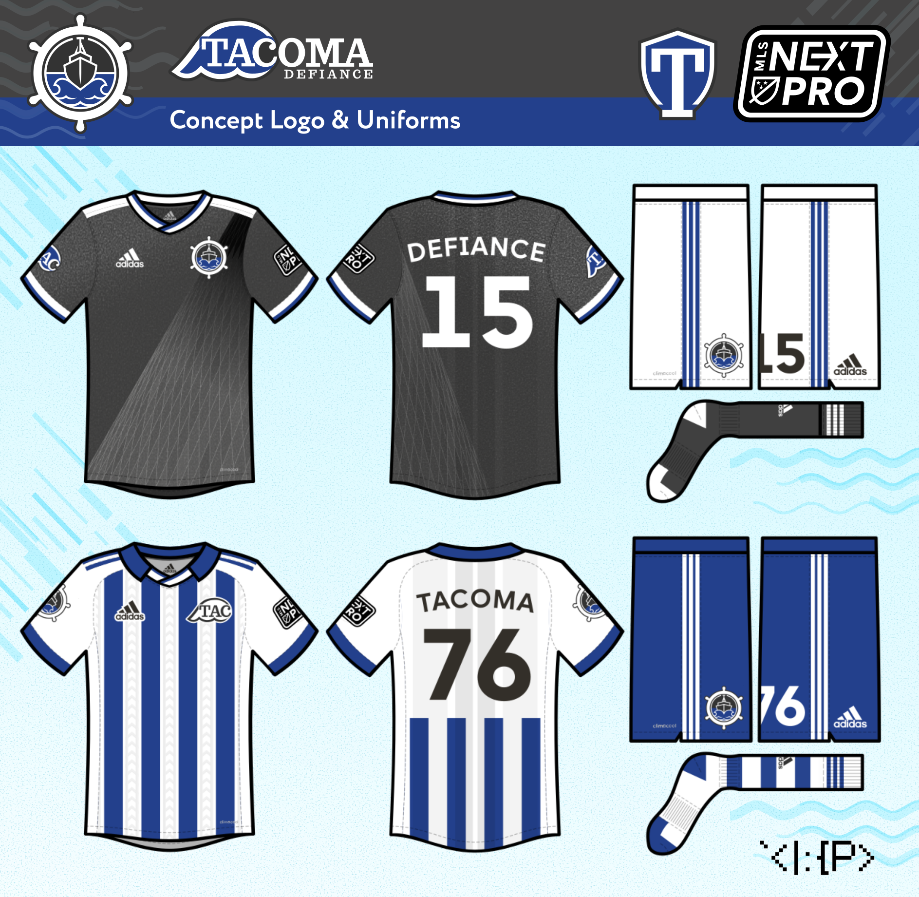
IMO, the IRL Defiance logo has way too much detail in some places (waves, tentacles) and way too little in others (boat, roundel container)... and the composition is just not great.
I just attempted to simplify the design and make it cohesive, while also adding a bit of Tacoma soccer history.
I add a ship wheel, cuz why not? The waves and wordmark idea are inspired by the original 1976 Tacoma Tides team of the American Soccer League.
The home jersey is dark dark gray (I like gray as a main color for Tacoma, as inspired by this "Grit City Gray" concept by @BagelHK), with a Museum of Glass design.
The away is a 1976 Tides fauxback, with subtle chevron stripes based on the iconic East 21st Street Bridge.
The away is a 1976 Tides fauxback, with subtle chevron stripes based on the iconic East 21st Street Bridge.
2016–23
Tacoma Tides
Tacoma Tides
2016–2023
Tacoma Tides Concept
Tacoma Tides Concept
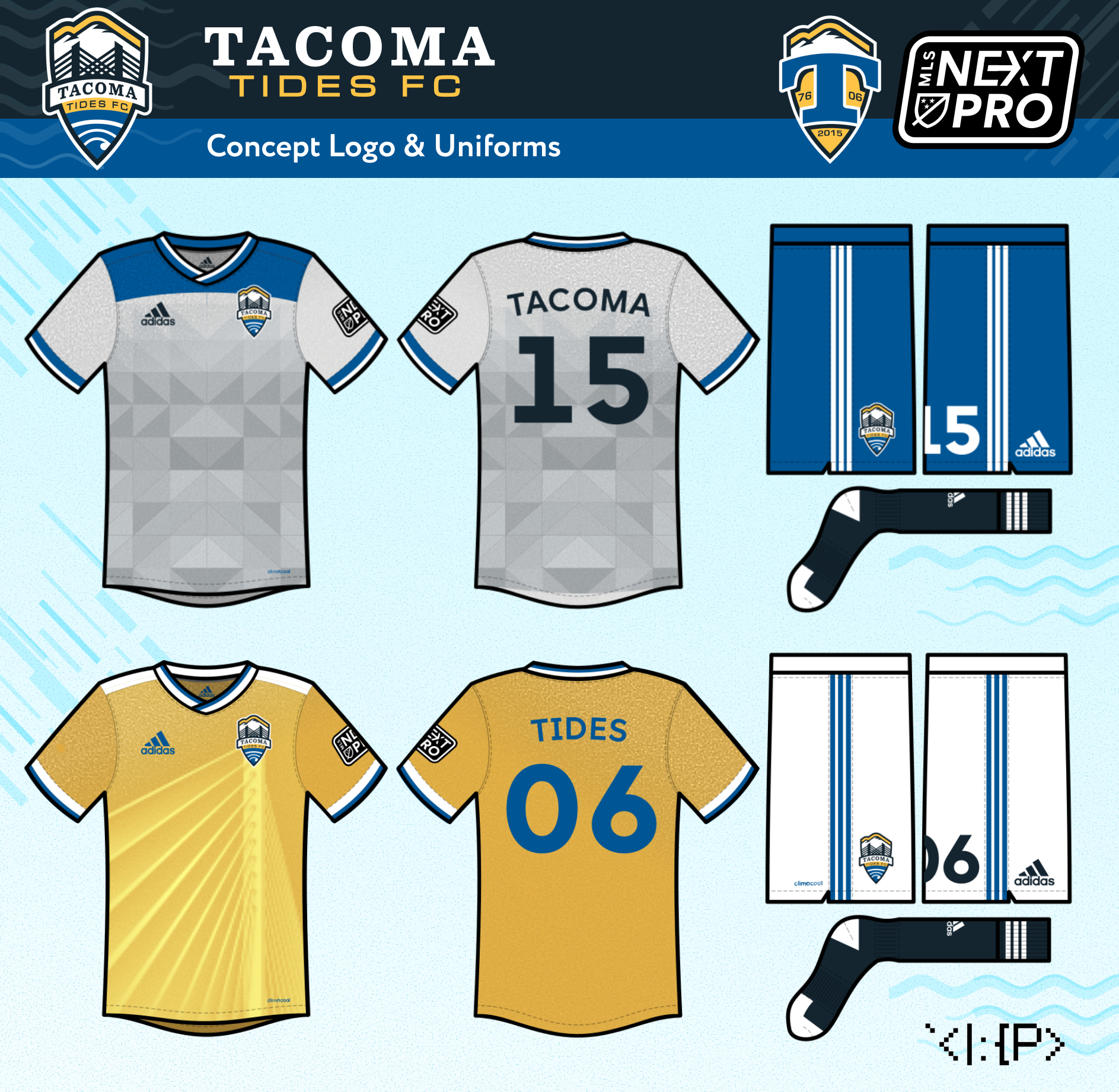
IMO, the IRL Defiance logo has way too much detail in some places (waves, tentacles) and way too little in others (boat, roundel container)... and the composition is just not great.
I just attempted to simplify the design and make it cohesive, while also adding a bit of Tacoma soccer history.
I add a ship wheel, cuz why not? The waves and wordmark idea are inspired by the original 1976 Tacoma Tides team of the American Soccer League.
At home, the team wears a gray Tacoma Dome triangle-patterned jersey.
On the road, the Tides wear a 2006 fauxback yellow jersey with an East 21st Street Bridge 3/4 profile view.
On the road, the Tides wear a 2006 fauxback yellow jersey with an East 21st Street Bridge 3/4 profile view.
All jersey designs use Raysox's template.