Seattle Storm Concepts
October 2020: Original Logo Cleanup
The team's existing primary logo is a bit busy, so mostly this is a cleanup. The Space Needle gets a new, less abstract silhouette, while the wordmark is flattened and simplified. The alternate logos include a version of the existing secondary mark, reworked into a raincloud, as well as a Space Needle + Mt Rainier logo and a evergreen tree + lightning bolt logo. The font is Mesmerize.
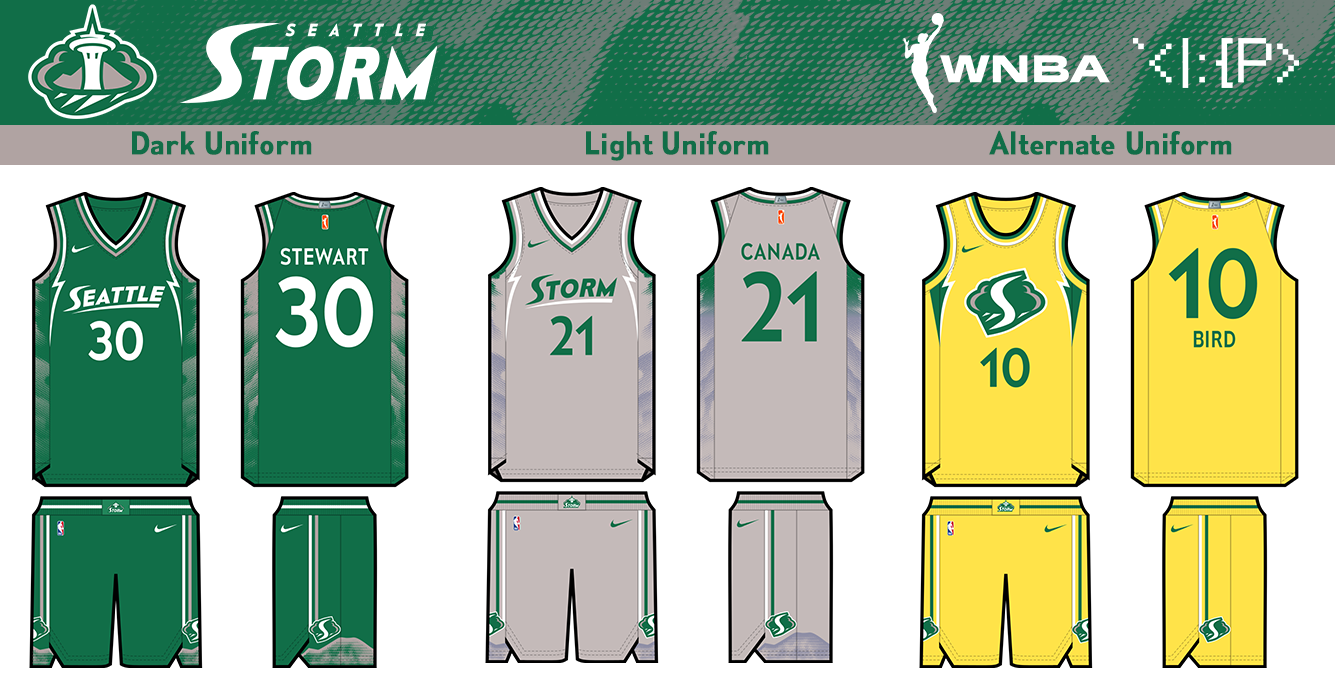 The WNBA currently uses highly-templated uniforms covered in ads. This set unrealistically depicts a return to a more conventional, team-focused design.
The two main jerseys have a raincloud-patterned side panel, slightly inspired by the 2003-2007 set. The trim incorporates lightning bolts. The wordmarks are simplified version of the Storm's original designs. The colors are limited to the green, silver, and white for an overcast aesthetic.
The alternate jersey is my attempt to adapt the 2018 & 2020 championship uniform into this set.
The WNBA currently uses highly-templated uniforms covered in ads. This set unrealistically depicts a return to a more conventional, team-focused design.
The two main jerseys have a raincloud-patterned side panel, slightly inspired by the 2003-2007 set. The trim incorporates lightning bolts. The wordmarks are simplified version of the Storm's original designs. The colors are limited to the green, silver, and white for an overcast aesthetic.
The alternate jersey is my attempt to adapt the 2018 & 2020 championship uniform into this set.
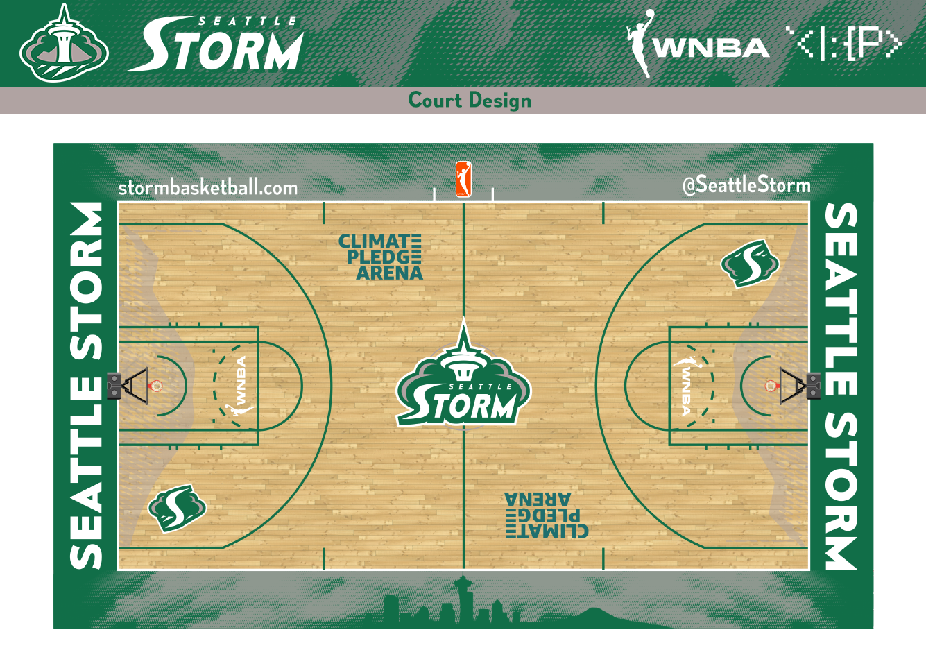 The court design has a rainy Seattle skyline pattern on the sideline and the Mount Rainier pattern from the uniform shorts.
March 2021: Current Logo Cleanup
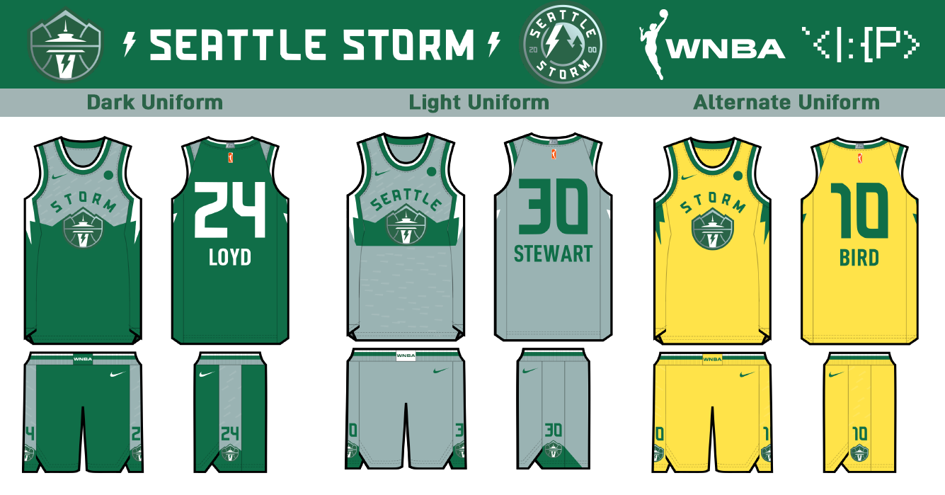 The team just came out with an unexpected rebrand, and it's an extremely nice and sorely needed update! I wanted to see if I could improve on a bit and mesh it with the concept I did in October.
The biggest change I made to the logo was to make the mountain more defined. Other than that, it's basically just a recolor.
In addition, I've created a new secondary roundel logo with an evergreen tree + lightning bolt design.
Since the logo is way more geometric and simple, the jerseys need to change to match. Both jerseys show a tonal gray rain pattern above a chest stripe of green mountains.
The gray jersey shows the Olympic Mountains across Puget Sound, while the green jersey shows the Cascades out inland.
The new side-panel lightning bolts match the new logo.